Cohesion Brewing
Branding & Pattern DesigN
Cohesion is a Czech-inspired brewery set to hit the Denver craft beer scene in 2021. I branded the brewery and consulted the founders and architects (UNUM Collaborative) as they built the physical space. For a preview of the taproom, check out the project on UNUM’s website.
Brand Elements
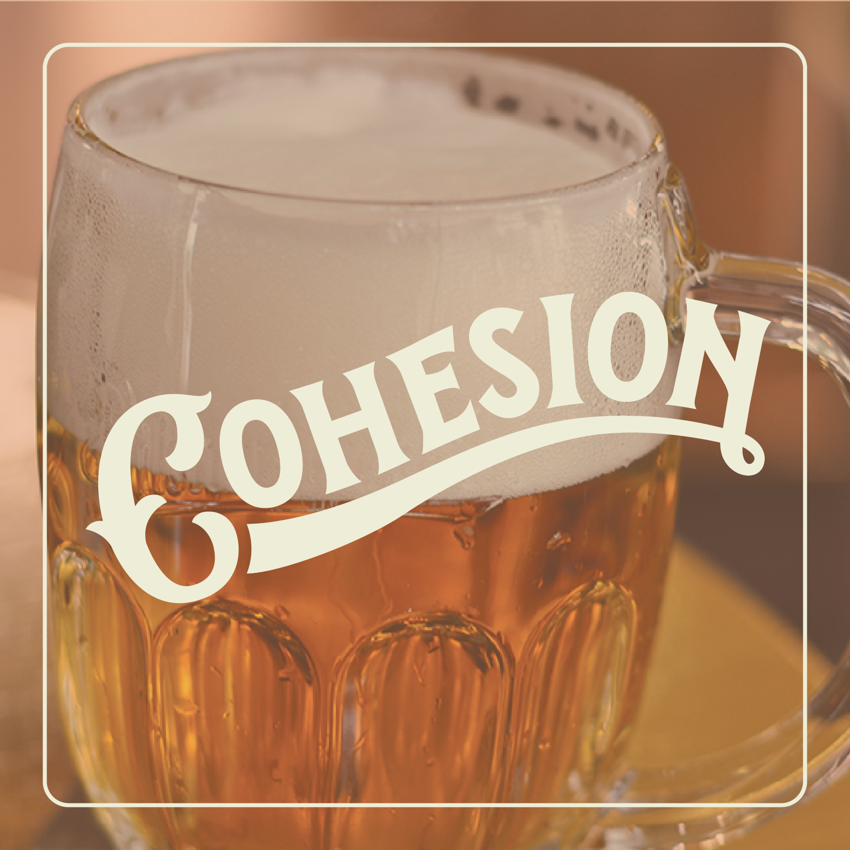
LOGO
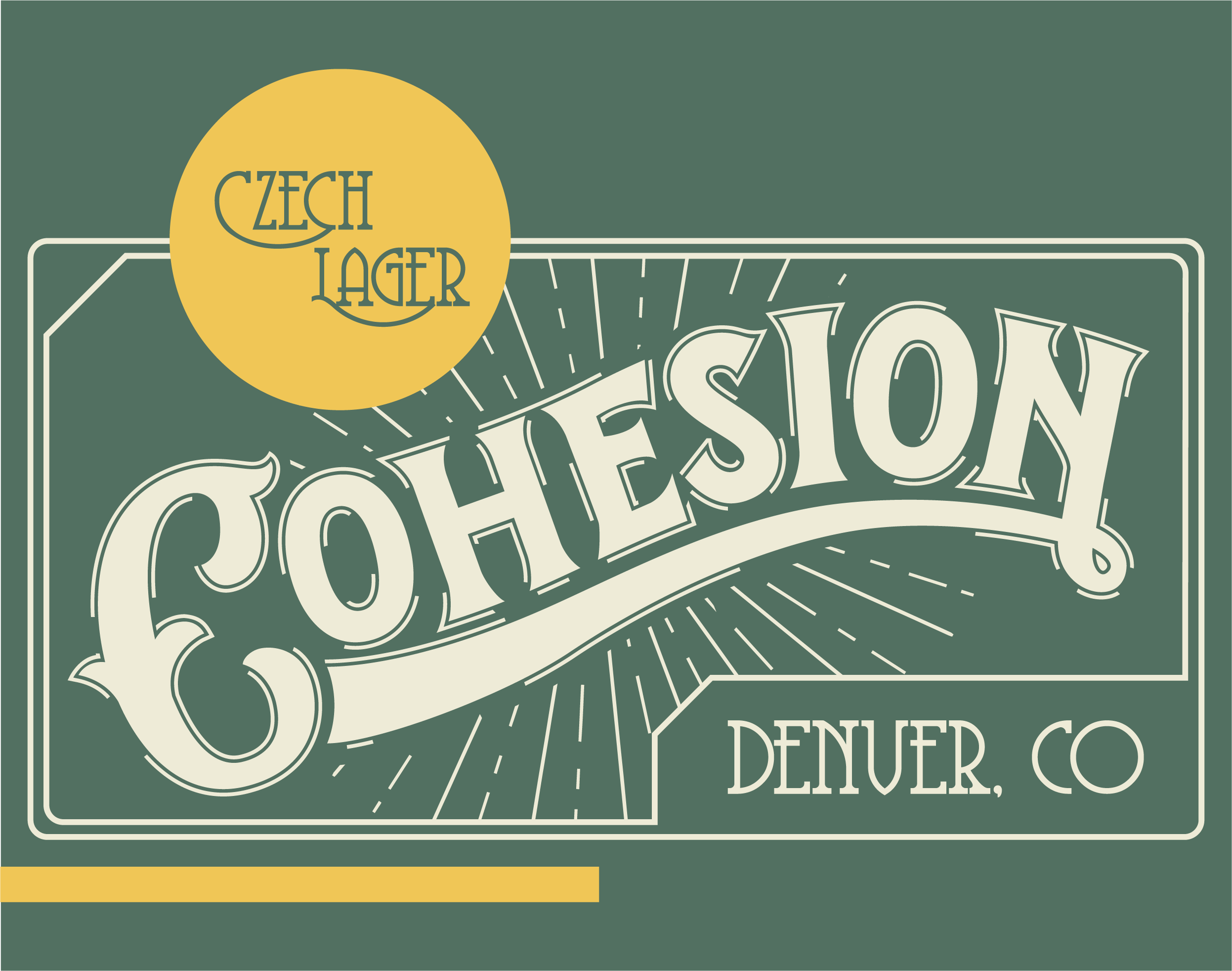
Cohesion’s logo is a custom mark inspired by the sweeping, decorative logos that are ubiquitous in Czech beer branding (Pilsner Urquell and Budvar are two classic examples). The full-color logo is to be used for signage, labels, tin-tacker designs and more. The broken stroke around the letters and the decorative linework in the background appears dynamic, as if the logo is actively cohering. This movement is meant to suggest a fusion happening within the brewery and the community surrounding it, and honoring the merging of Denver’s craft beer scene with Czech beer culture. The container around the logo is derivative of Pilsner Urquell’s logo, but also references the containers and frames present in Alphonse Mucha’s work.


SECONDARY LOGOS
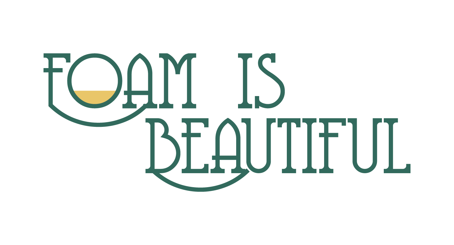
There are a few options for secondary logos for Cohesion. The “C” may be featured independently from the rest of the word in two different styles; Shadow and Chisel. The isolated “C” can be framed in a circle or it can stand alone. Cohesion’s catch phrase, “Foam Is Beautiful” may also be used as a secondary logo. This phrase refers to the unique appreciation for foam in Czech beer culture, and celebrates what differentiates Cohesion in Denver’s craft beer scene.

COLOR PALETTE
Inspired by the city of Prague, Cohesion’s color palette contains an assortment of mossy greens and neutrals with pops of gold and red. Czech architecture commonly features white buildings with red roofs and gilded details. The murky greens and greys reference the cloudy Czech sky and the abundant greenery. This green/red/white/gold combo is the most popular color combo for Czech lagers, adorning the labels of many of the most popular Czech breweries including Pilsner Urquell and Budvar.


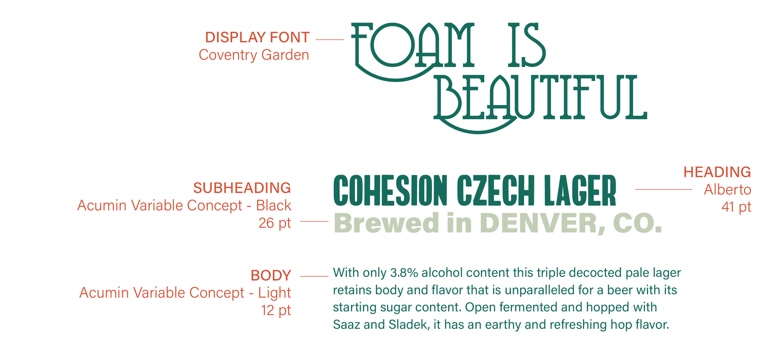
Typography
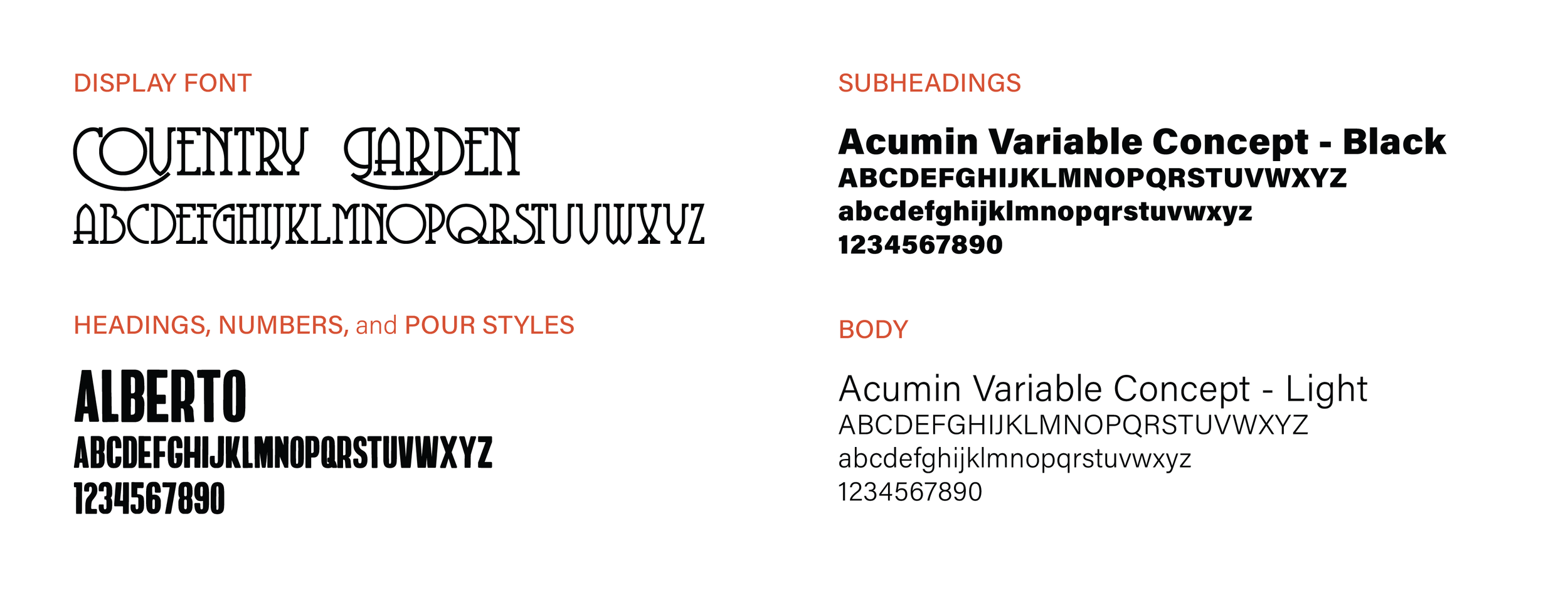
Type in Use
Patterns
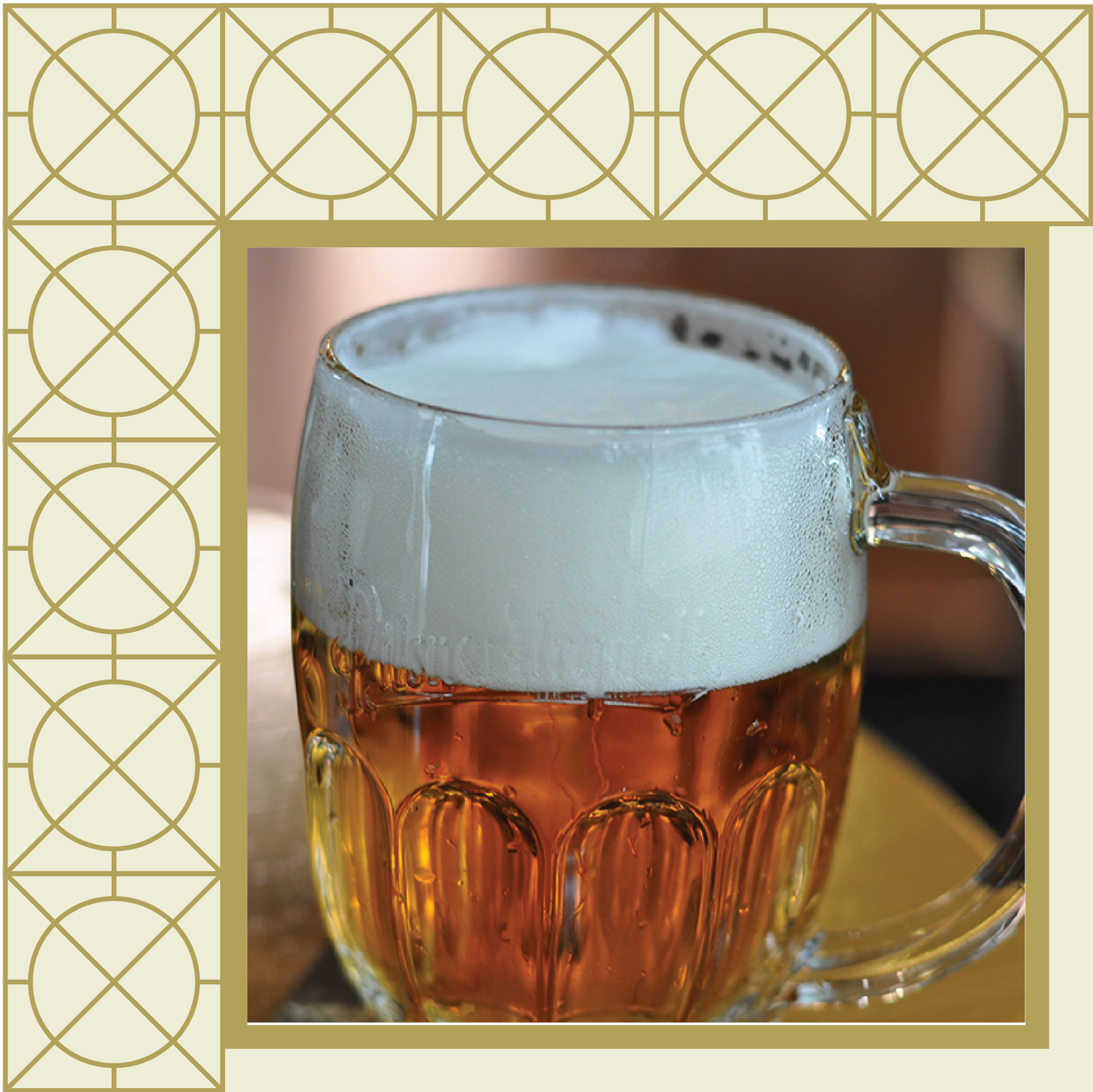
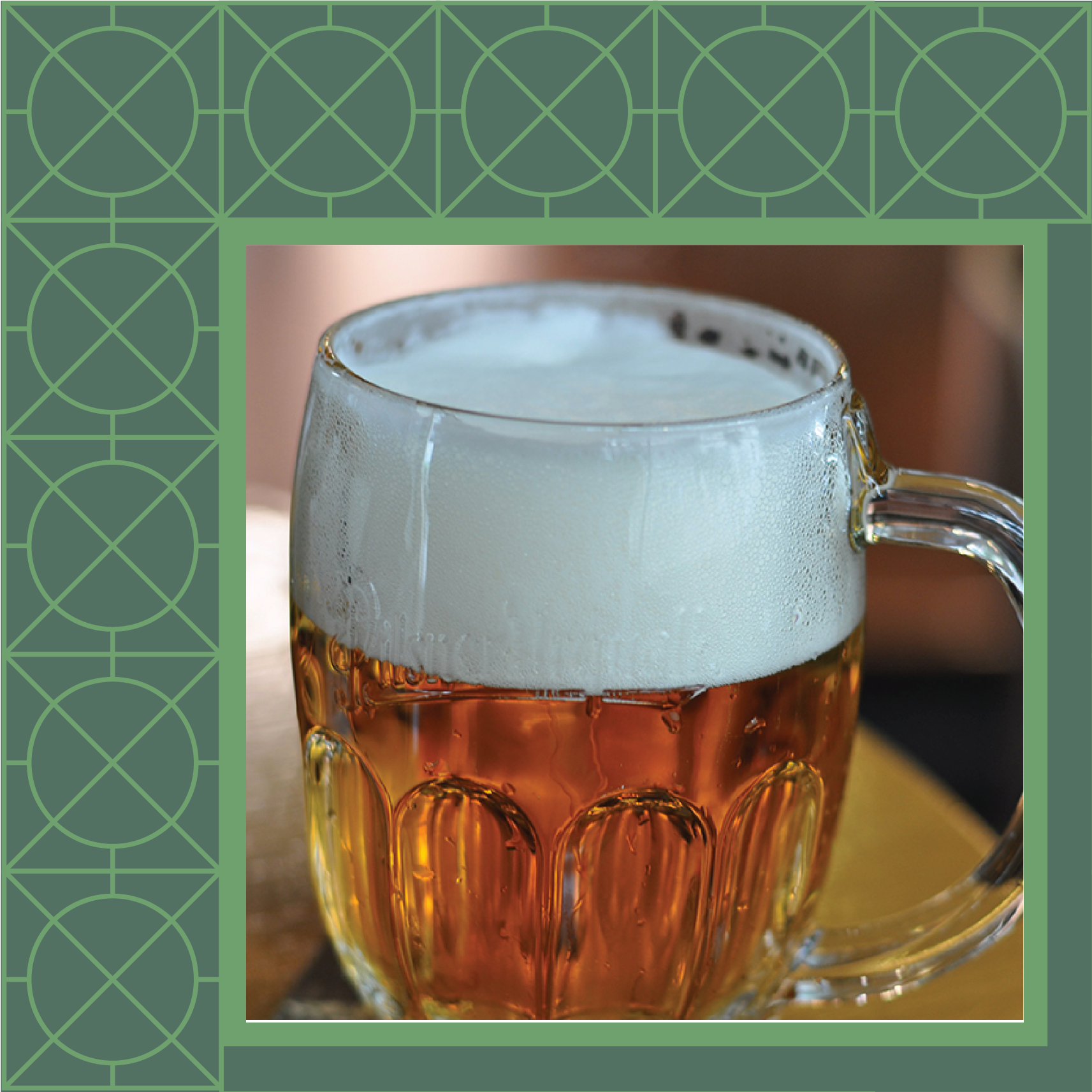
Cohesion's patterns are two-color, linear patterns derived from patterns found in Czech architecture.


ILLUSTRATION
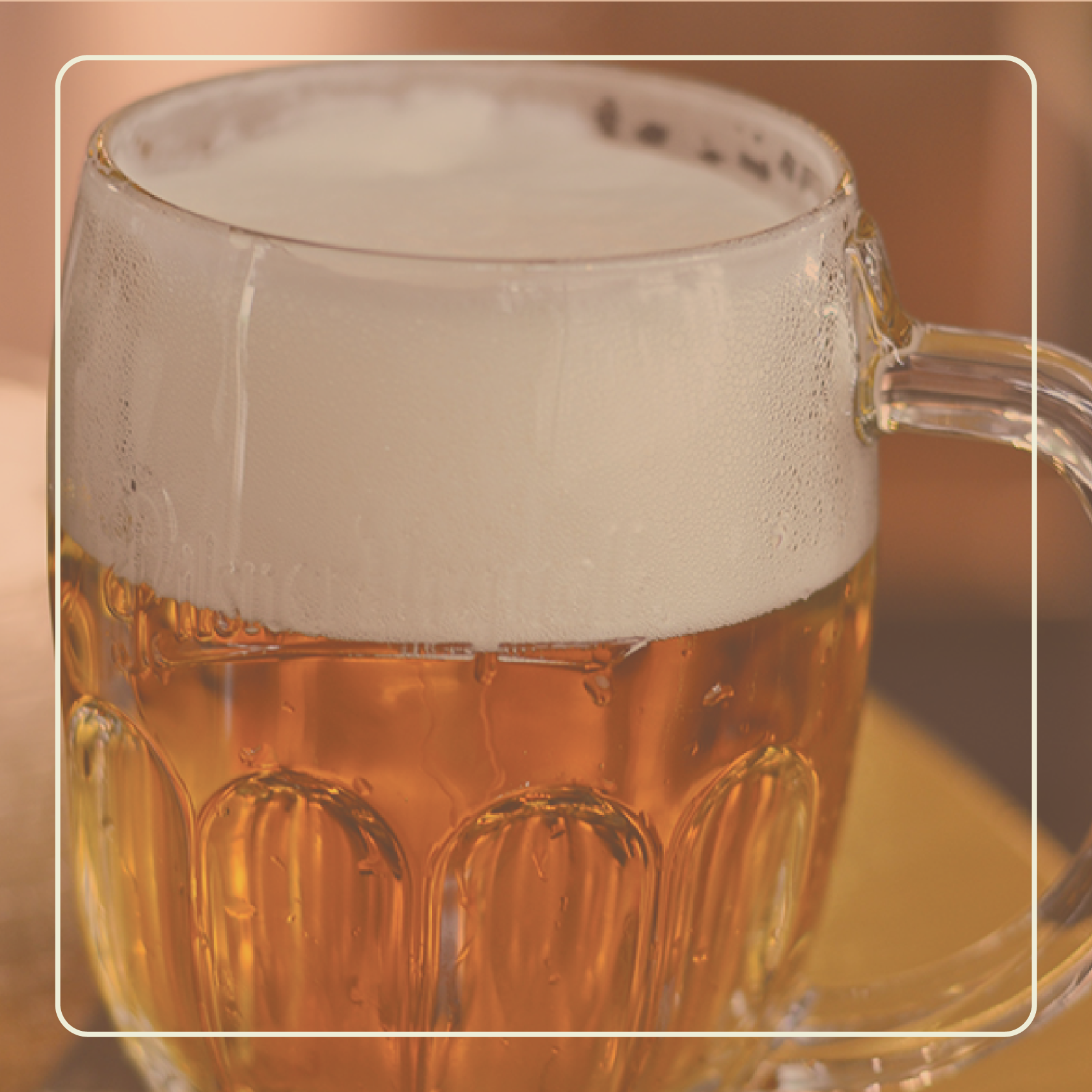
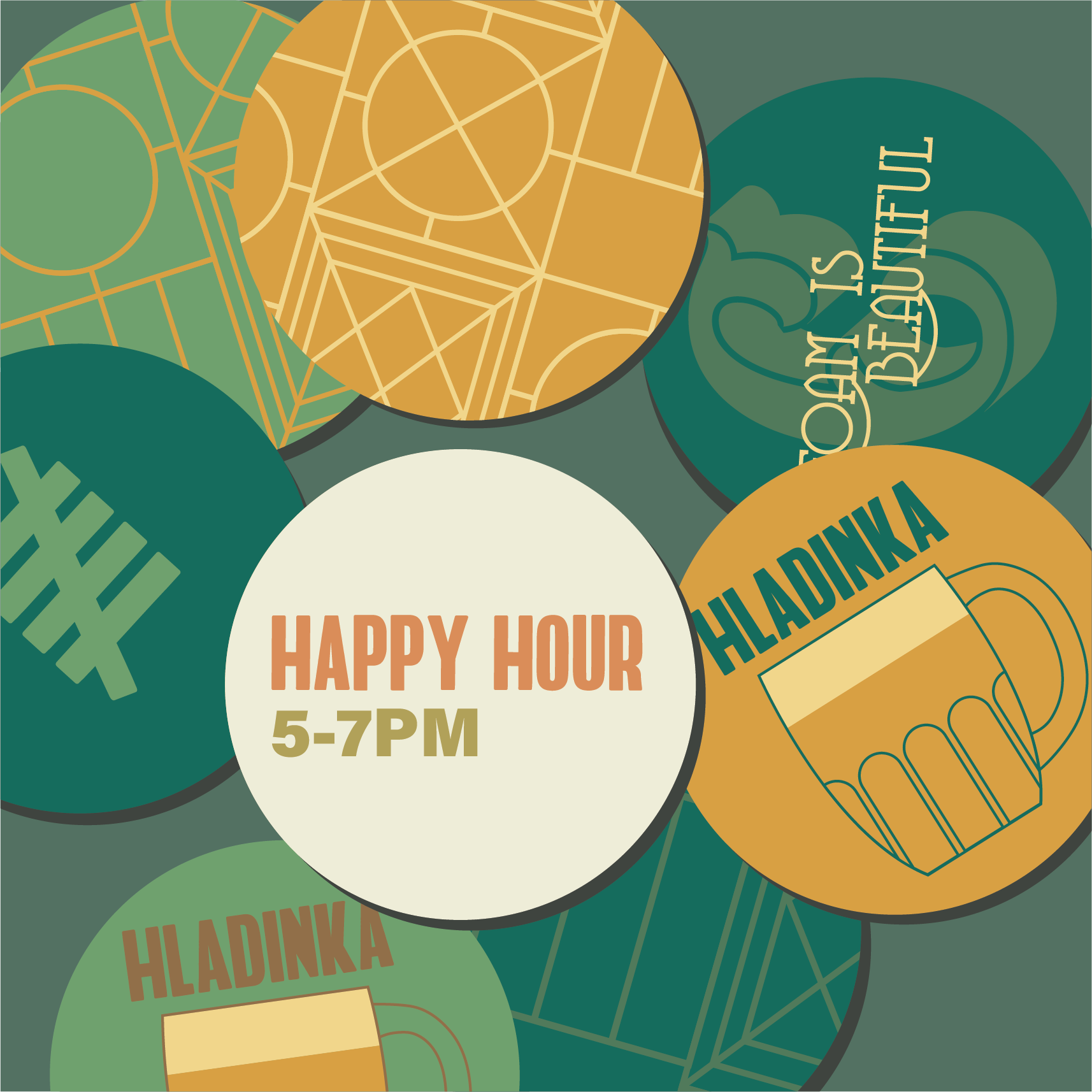
As part of the Cohesion brand, illustrations play the role of educating customers about Czech beer culture. Foam plays a big role in that culture, so I illustrated the three Czech pours. Each pour has a different amount of foam, which changes the flavor of the beer. Tally marks are another motif. Czech breweries traditionally keep count of how many beers a customer has had by keeping tally on the customer’s coaster.


Brand in Use
THE BREWERY
My patterns will be featured as wallpaper in the physical brewery, opening in 2021. I designed a custom pattern for a short wall that will be a focal point in the taproom.

COASTERS


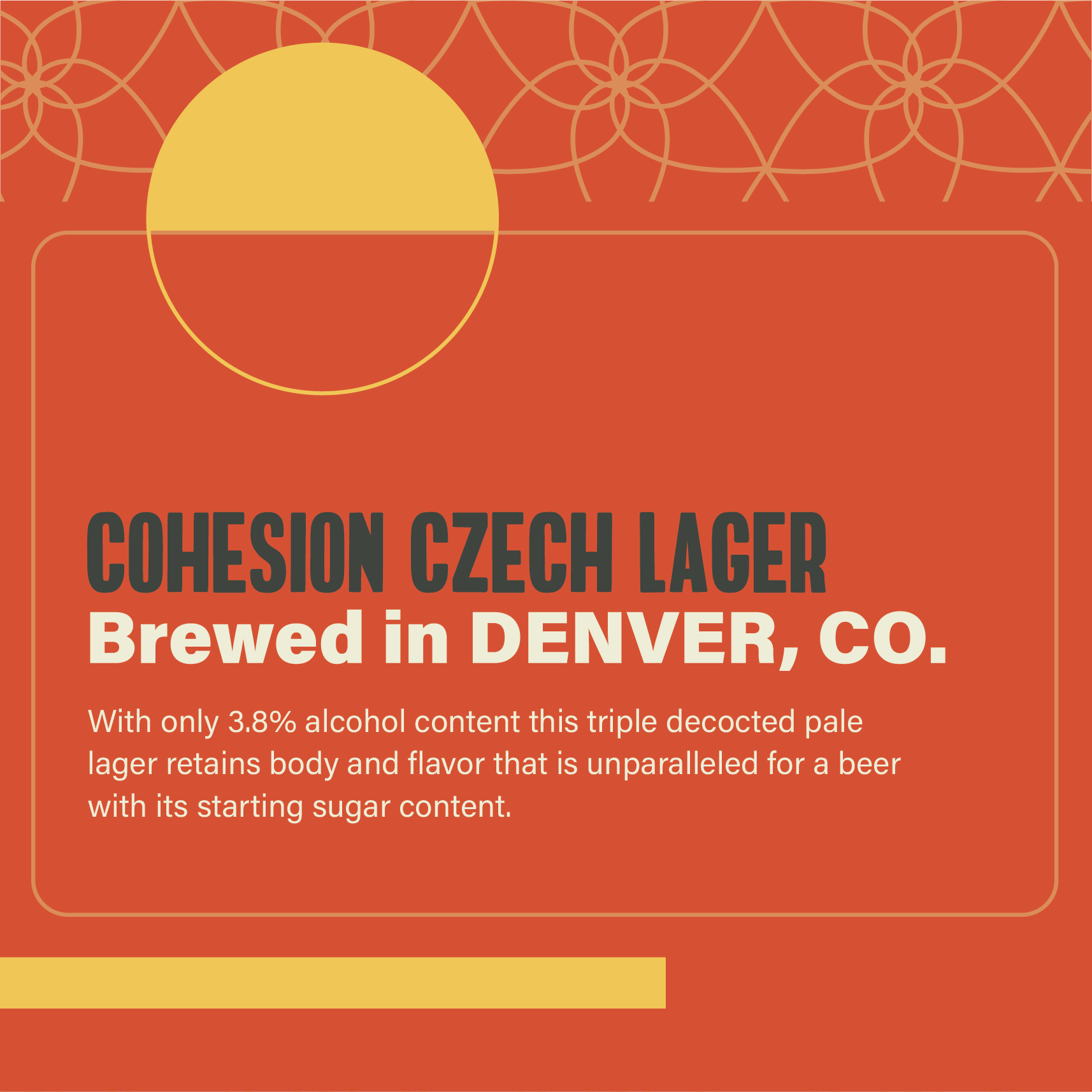
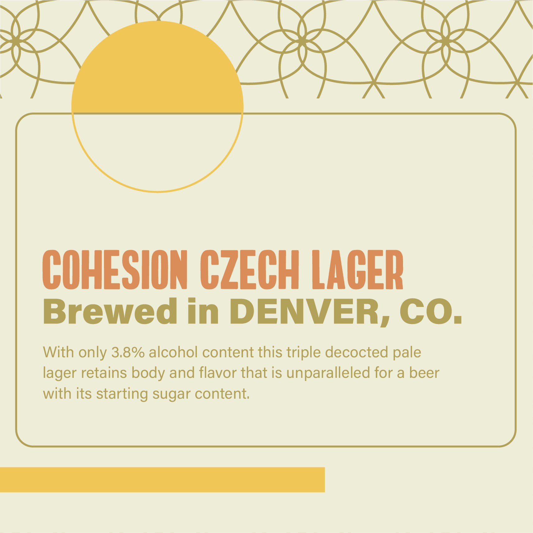
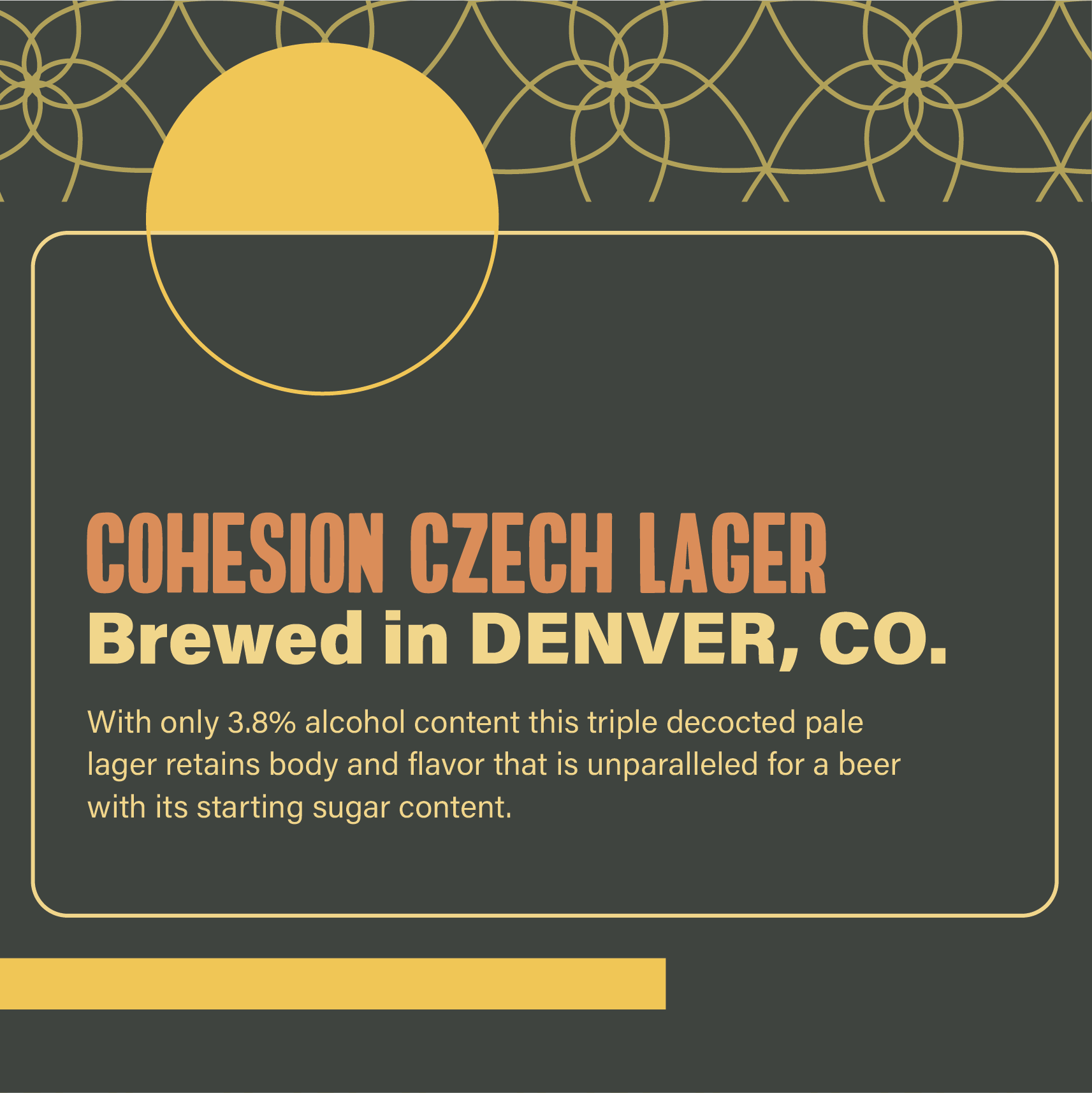
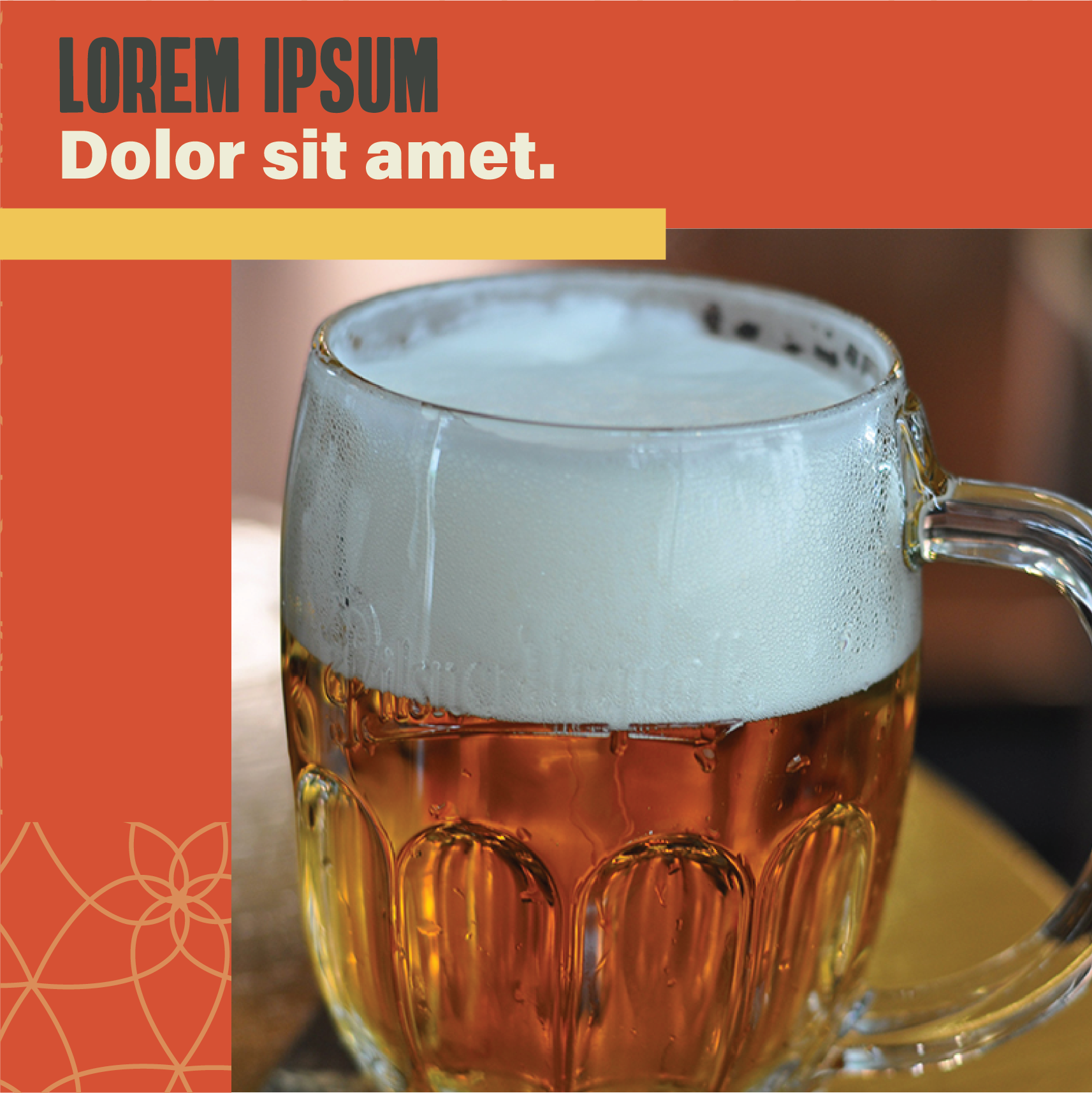
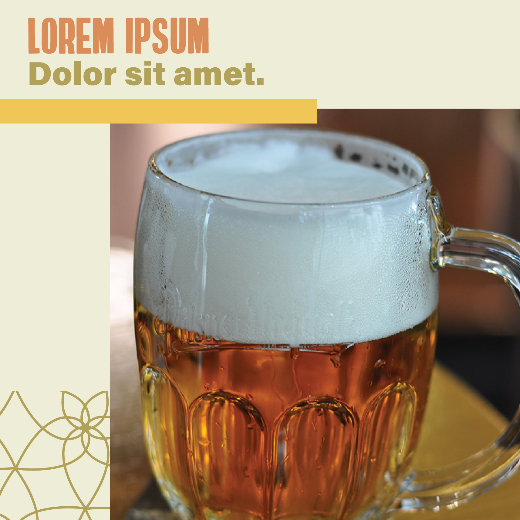
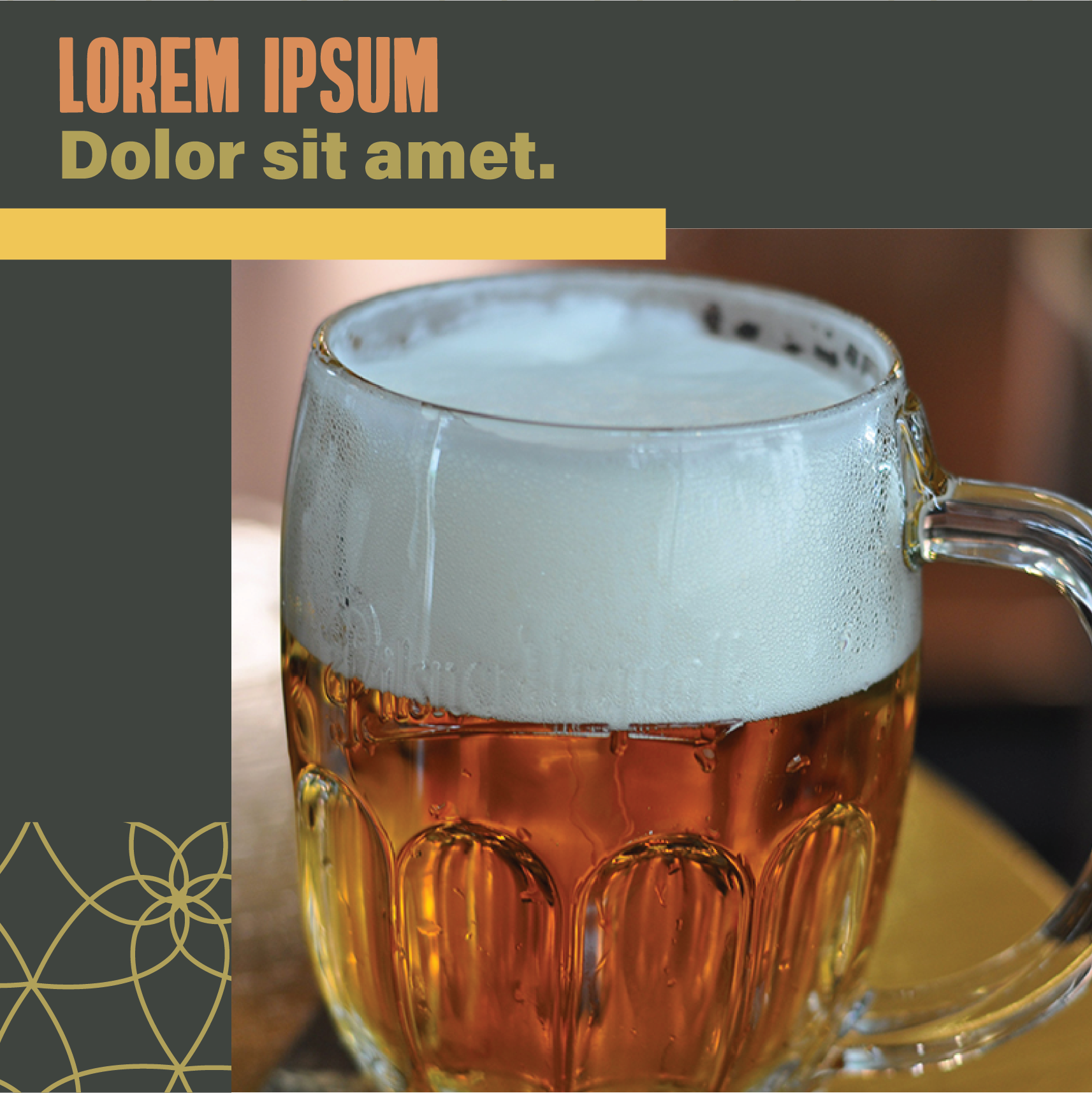
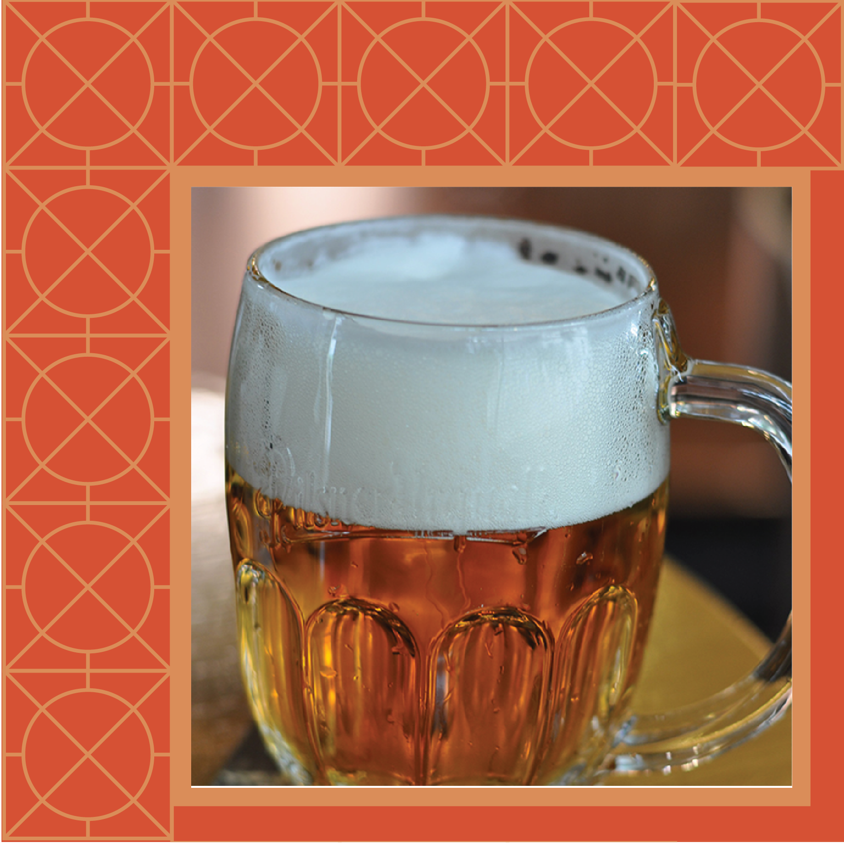
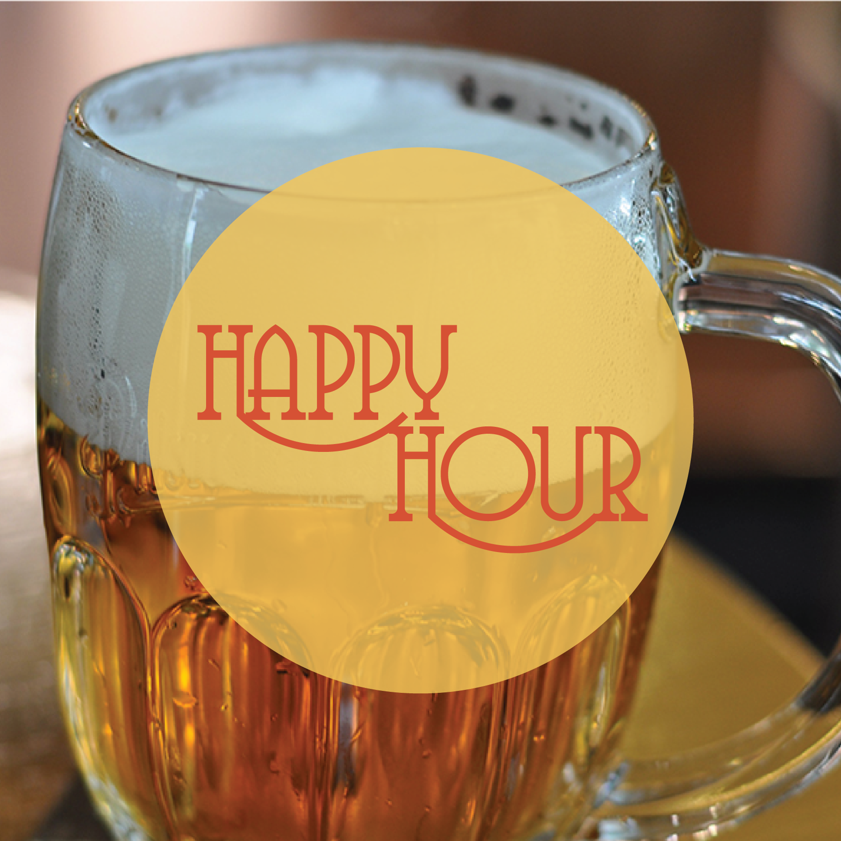
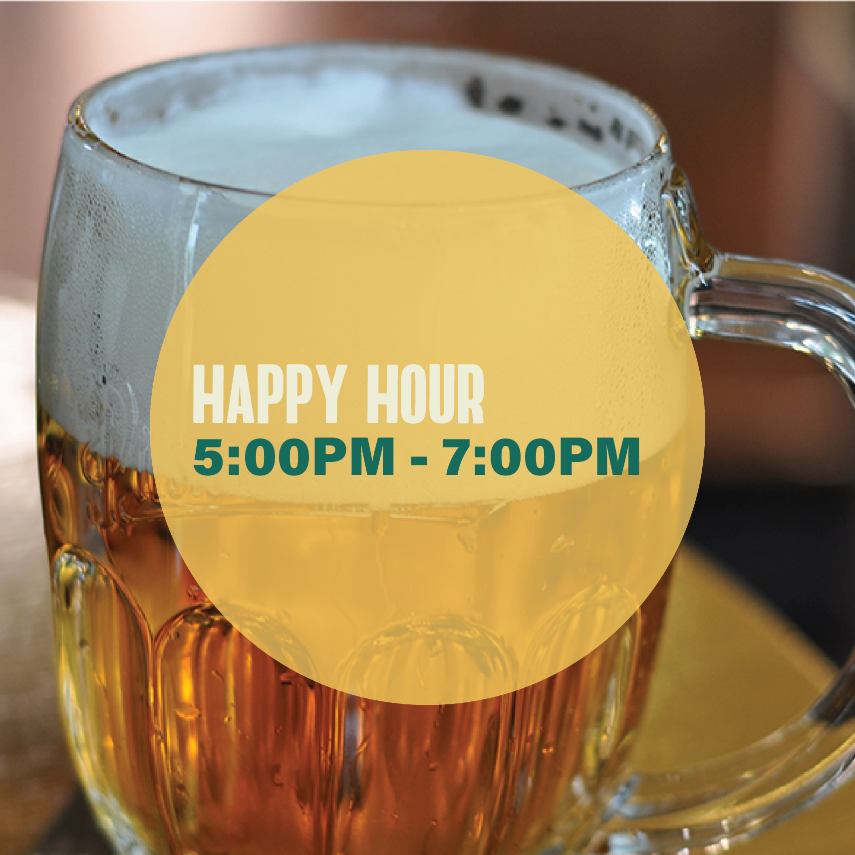
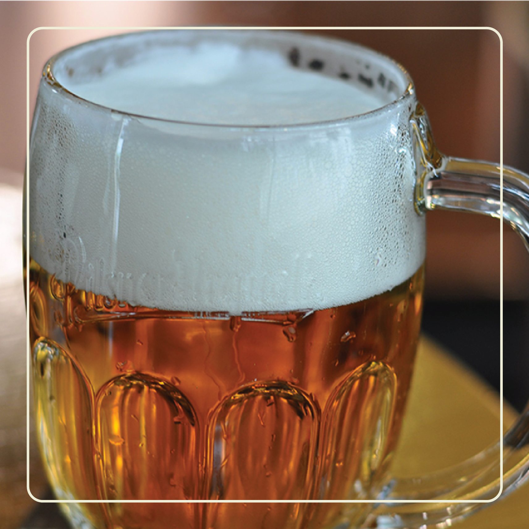
SOCIAL MEDIA KIT
I designed a series of Instagram templates for a variety of potential posts, including new beer and special event announcements, as well as photos of the brewery at various stages of construction.