
Knotty Tie Rebrand & Email Campaign
BRANDING, ILLUSTRATION & UX/UI
I led a small team in a 6-month overhaul of all Knotty Tie Co. transactional emails. We rebranded the company and then redesigned about 50 emails based off our user research findings. The result was a 50% reduction in inquiries from confused customers with no reduction in sales.

4 MINUTE READ TIME
0. Overview
After the launch of the Configurator in summer of 2018, my design team was tasked with updating all the transactional emails to reflect our new design process. We were also tasked with rebranding the company. We redesigned dozens of emails in 3 different pipelines - Weddings, Organizations, and Individuals. We used analytics, user interviews, and user testing to tailor the Frequently Asked Questions and Calls to Action to the user’s mentality at each particular stage in the design process. Frustrated by the limitations of Shopify’s email builder, I taught myself how to code emails using HTML5. Additionally, I created custom illustrations for each email.
ROLES
User Research, Graphic Design, Branding, Coding, User Testing
TEAM
DURATION
6 months
TOOLS

Our Goal
Reduce customer confusion about our design process

How will we know if we’ve met our goal?
Decrease in confused email & phone inquiries with no reduction in sales
Rebranding Knotty Tie
a) Style Guide
Masculine: Though a large portion of our customers were women shopping for men, we wanted to keep the color palette masculine so men could see themselves identifying with our brand.
Sophisticated: Our old palette consisted of a bright orange, black, white, and a range of grays. We upgraded the color palette, keeping orange as a focal point but balancing it out with a softer selection of colors.

b) Illustration Style
I went through numerous iterations of every illustration, presenting my progress to stakeholders on a bi-weekly basis until we established an illustration language that we felt represented the brand and spoke to our customers


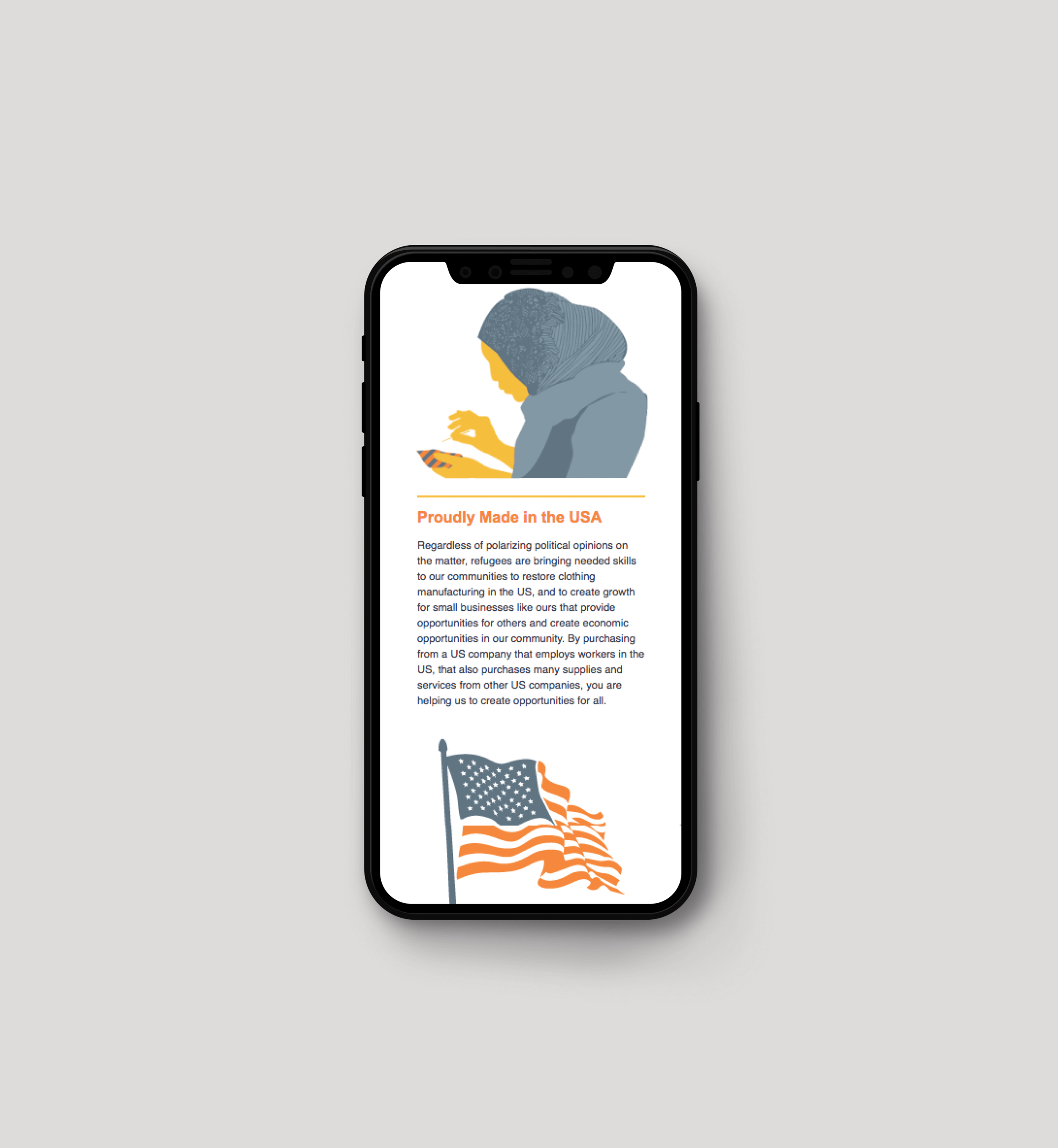
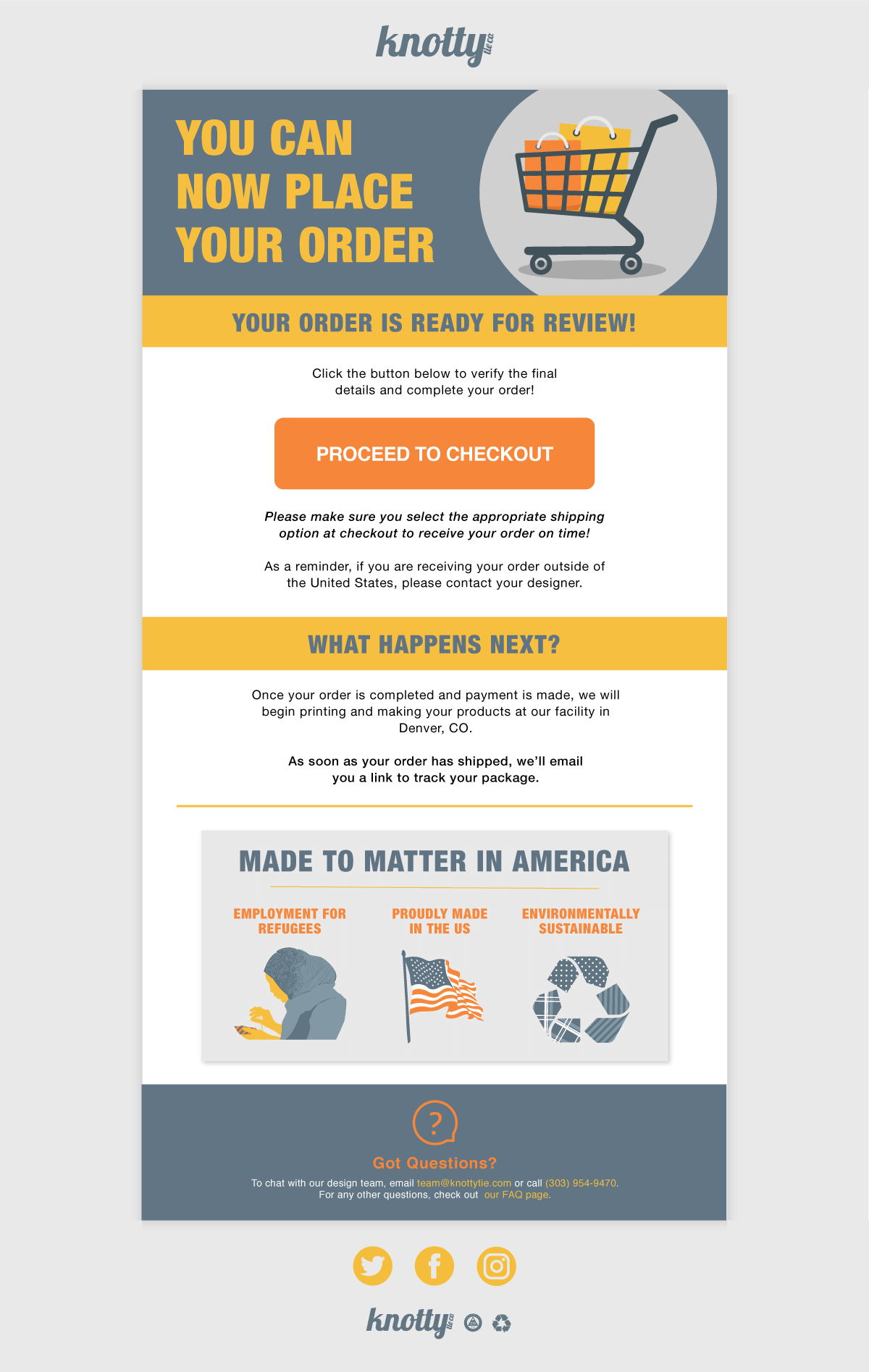
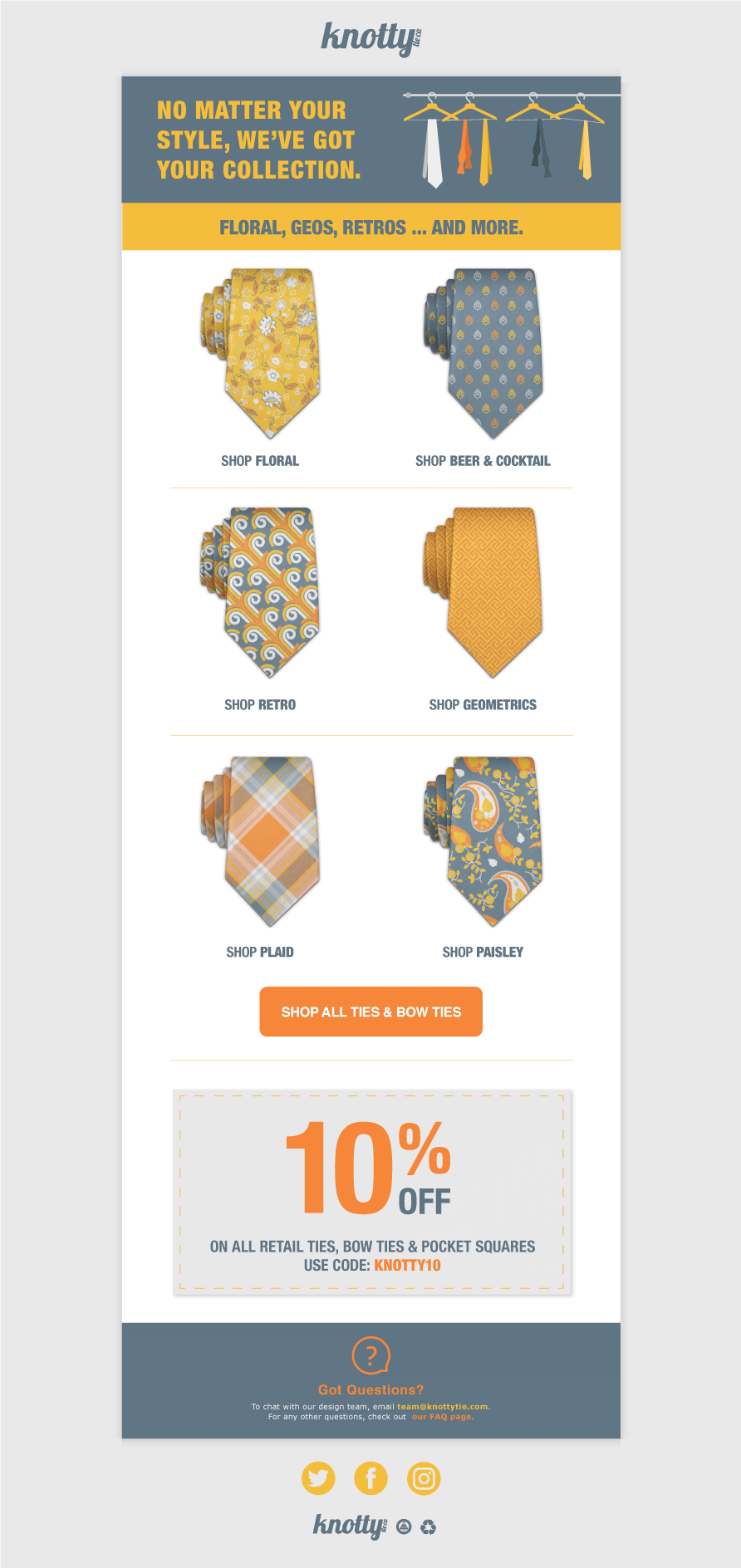
c) Branding applications
We applied our branding standards to various projects within the company.
RETAIL
Posters for the retail shop highlighting popular pattern collections
PRINT COLLATERAL
Packaging inserts for inclusion in the box with every order
Intended to carry the branding through to the end of the process, remind customers of Knotty Tie’s mission, and encourage them to leave a review
WEB BANNERS
Special occasion web banners and email banners for Black Friday and Christmas
Welcome Email: Before/After
Our first challenge was to redesign the Welcome Email.
BEFORE:
The initial email was a two-page letter from the founder
Contained valuable information that established value for the brand
Universally ignored because it was too daunting to read
In the initial design process, users had to wait 1-3 business days to receive their first proof from a designer. This was unfamiliar to users and we lost business when people kept shopping on other sites after they placed their inquiry
The Welcome Email needed to get the user excited about receiving their first proof, but the initial email did nothing to capitalize on that opportunity
GOALS:
Break up the information into more readable segments
Augment text with images that conveyed the message in a glance
Get users excited about receiving their first proof
RESEARCH:

FAQs & CTAs
We used User Interviews to determine the most Frequently Asked Questions at each stage of the process.
We used Google Analytics to determine where most users were clicking in each email, and tailored the Calls to Action based on our findings.
Responsive UI
We determined using Google Analytics that most users were viewing our emails on mobile.
We did extensive testing on each email to ensure that it looked good on both mobile & desktop.
BEFORE/AFTER

Before Redesign

After Redesign
Other Emails
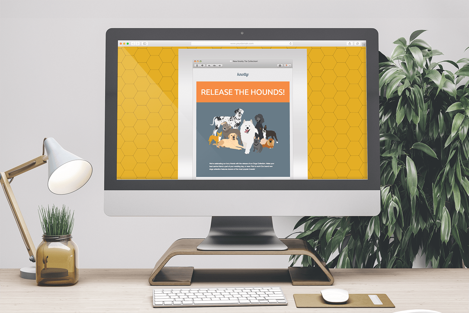
Collection Release: Dogs


Submission Received


Why Go Custom?


More Goodies


Impact

~50
Emails redesigned in 6 months

50%
less customer inquiries while maintaining sales