
Knotty Tie Configurator
UX/UI
Knotty Tie Co. is a rapidly growing Denver startup whose main source of revenue is custom ties. My team created a web tool that changed how users interact with the company, solved a growth bottleneck, and quadrupled online retail sales in a single year.

7 MINUTE READ TIME
0. Overview
In the spring of 2018, Knotty Tie assembled a team to address the major issue standing in the way of our growth - the scale of the business had outgrown the capabilities of our customization process. We ran a week-long agile sprint, during which we went from brainstorming to testing a mock product with real users. As the only designer on the team, I spearheaded the design vision, created wireframes and mockups, and ran user testing.
ROLES
Interviews, Ideation, Wireframes, UI, Prototyping, User Testing
TEAM
1 designer (me), 2 founders, 1 marketing manager, 1 developer
DURATION
Agile Sprint : 1 week
Implementation & Iteration: 9 months
TOOLS

Our Goal
Create an automated, scalable tool that maintains/improves design experience.

How will we know if we’ve met our goal?
If a user can decide and design what they want and check out on their own.

Short Attention Span?
Skip to the best part…
1. Problems
We started our design Sprint by interviewing Knotty Tie employees from all departments, evaluating what they would need from our tool, and what they thought our users would need. Particularly helpful were our interviews with the other members of our design team, who interact one-on-one with users on a daily basis. Our designers had intimate knowledge of the things our users liked and the places where they struggled in our previous design process. What follows is a list of the main problems we hoped to tackle.
a) Finalizing details/checkout
Text Heavy: Relied on a long winded email that users weren’t reading
Unfamiliar Design Patterns: users expect to check out independently on the website, but our checkout process happened via email

b) Conveying complicated printing issues
Relied on designers to find and communicate potential print issues to users
Users often skimmed over warnings in emails and proofs and ended up unhappy with final product
Transitioning to a system where users could design and purchase ties independently meant finding a better way to convey print issues before purchase

c) Providing style guidance
Design process started with a style quiz that recommended patterns to users
Algorithm was poor at matching descriptions to patterns
Style quiz was successful at capturing leads but poor at providing the guidance users wanted to help them make decisions

d) Shortening response time
Average response time was 1-2 business days
Users were frustrated by slow response time, because it is typical to receive instant customer service online
Slow response time made us unable to accommodate very short turnarounds
Lost users who continued shopping after they submitted an initial inquiry

e) Better utilizing design talent
Designers were constantly buried in repetitive and basic design work
Consumed by production queue, designers could not devote time to projects that would improve the brand and increase sales
Projects such as increasing social media presence, updating the website, and creating fresh patterns were constantly on the back burner

2. Thought Process
By the end of the weeklong Sprint we had built and tested an Invision prototype. What follows is a list of our major innovations and how they addressed our problems.
a) Building confidence through the landing page
Aimed to accomplish 3 important goals:
build user confidence that they were working with real people
explain our process
address our most frequently asked questions
Intended to provide style guidance for the user from the get-go by offering 3 starting points
Style Quiz
Choose Patterns
Choose Colors
Starting points were determined by interviews with design team, who knew what customers were looking for when they first came to our site

b) Upgrading the style quiz
Improved the algorithm that matched descriptions with patterns
Provided lifestyle pictures as inspiration
Marketing research indicated users became more engaged with our website when they saw our products on people
User testing confirmed that the live photos gave users the impression that they were getting tailored style guidance

c) Expediting the color selection process
Allowed users to designate a main color, a secondary color, and accent colors
Eliminated a step from the process where designers had to guess the main color in the user’s color palette, freeing up designers for other projects
Aimed to reduce duration of the process from initial inquiry to purchase

d) Populating patterns in the user’s colors
Instantly populated patterns in the user’s chosen color palette
Responded to frequent concerns that users had trouble visualizing our patterns in their colors
Aimed to expedite the process by allowing users to see immediately if they liked a pattern in their colors, instead of choosing patterns and colors and waiting for a designer to send a proof
Intended to reduce revision requests, freeing up design manpower for other tasks

e) Simplifying the “Finalize Details” stage
Enabled users to view their entire collection of items at once
Calculated total in real time as items were added to cart
Eliminated the confusion caused by “finalize details” email
Followed common design patterns across internet
Confirmed in testing - users knew instinctively how to check out

f) Introducing The Configurator
Enabled users to shuffle their colors on their patterns in real time
Eliminated lag time between proofs
Reduced miscommunications between designer and user
Rendered on real products, responding to marketing research indicating user preference for real product photography


90%
of our designers’ time was previously spent creating proofs. The Configurator would put that task completely in the users’ hands, giving designers 90% more time to spend on brand-building projects.

100%
of users tested were delighted by The Configurator. It was fun and satisfying for users to get to be in control of their own colors and patterns, and seeing them rendered on products helped them visualize the end results.
3. Solution

The best solution is the simplest.

We initially thought the personalized touch of working directly with a designer was important to our clients. Through user testing we realized that most wedding clients preferred a quick, intuitive design process that is similar to how they shop elsewhere online. So we scrapped the rest of the design and focused on making The Configurator in its finest form.
Step 1) Pick your pattern
Users get overwhelmed if they are presented with too many options at first. The 3 Starting Points idea (see 2a) was unnecessarily complicated.
Made the online retail collection the entryway into The Configurator
Greatly expanded the online collection
Provided 4 pre-designed colorways for each pattern for customers who want more guidance
Organized patterns and made them searchable to enable customers to shop with intent

Step 2) Pick your colors
Enabled users to choose up to 6 colors, depending on the number of colors in the design
Eliminated the need to choose primary, secondary, and accent colors (2c) because we put color shuffling completely in the user’s hands
Added filters to help users find their colors
Responded to customer feedback on our original design that the color picker tool was fun and easy to use

Step 3 ) Customize your designs
Created a tool that instantly populates the user’s chosen pattern in their colors
Enabled the user to shuffle colors. Shuffle was a feature introduced in the mockup that delighted users
Populated designs on real photographic mockups of products
Responded to marketing statistics indicating greater sales on products mocked up on real photography, as opposed to digital renders
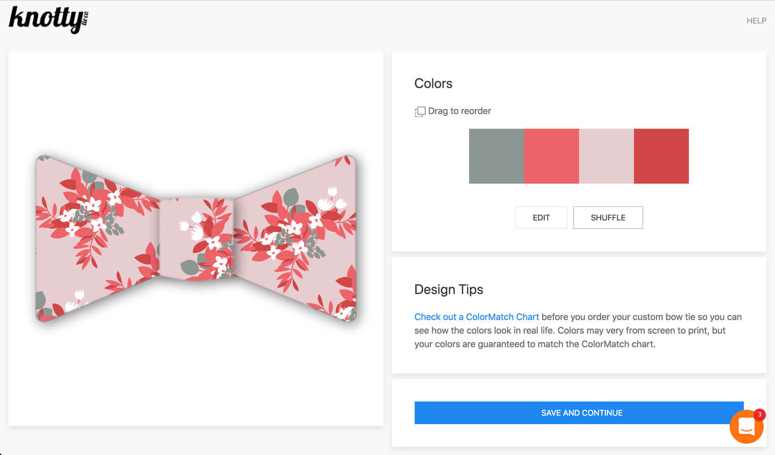
Step 4) Finalize details & check out
Allowed users to finalize their details and choose sizing without leaving their internet browser
Replaced extensive email conveying print issues with a simple design tip within Configurator, advising customers to check out a color chart before purchase

4. Impact

Solved a growth bottleneck
By putting design and checkout in the customers’ hands, the company could increase sales without needing to hire more designers to meet increasing demand

Quadrupled
online retail sales in a single year

But enough chit-chat.
Let’s see it.