North Wynkoop
BRANDING, PATTERN DESIGN & WEB DESIGN
In summer 2019 I was asked to brand North Wynkoop, a multi purpose warehouse space in Denver’s RiNo district. North Wynkoop houses concert venue Mission Ballroom and pop-up food truck garden Wynkoop Alley. In the future this space will hold retail stores, a coworking space, and more. In partnership with Two Parts, I created a brand guide and executed a series of banner ads and a responsive website according to brand standards.

Core Brand Elements
COLOR
The primary colors for North Wynkoop are black and white, with buttery secondary tones added in for texture. For branding, white may only be used on top of the butter color at full opacity for text - and never for body copy - only headers. A muted red will act as a tertiary color for emphasis when needed.

TYPOGRAPHY
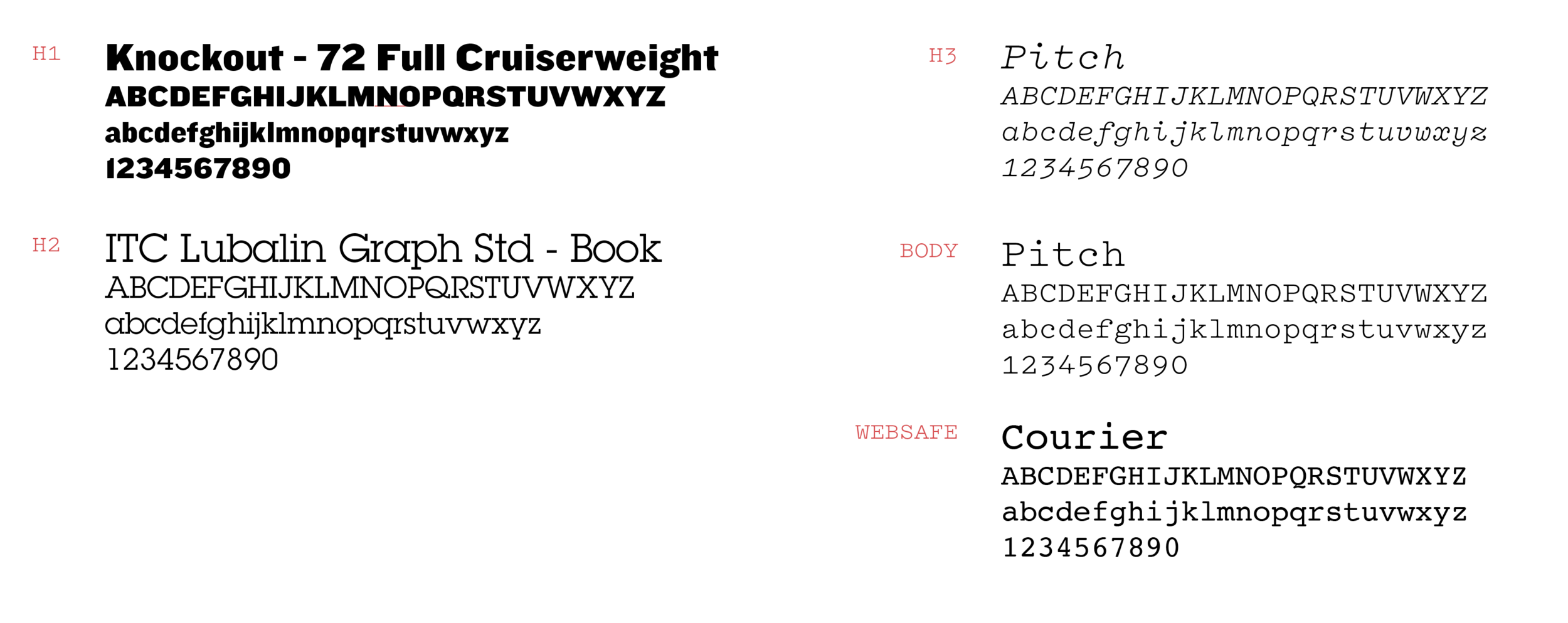
TYPE IN USE

LOGOS & SEALS
The main logo is the North Wynkoop logo (which I did not design). I created secondary logos meant to play nicely with the main logo while tying in themes from the branding. The reverberating “NW” logos play to the concept of noise/sound/buzz as represented by reverberating lines. The “wink” secondary logo cheekily references the word “wink” in “Wynkoop”.


Main Brand & Secondary Brands
North Wynkoop is a space in flux, so I wanted to make the branding dynamic and scalable. I created a “master brand” for North Wynkoop itself, and “secondary brands” for the spaces within North Wynkoop, including Mission Ballroom and Wynkoop Alley. Each secondary brand centers around a unique pattern, and each time a new tenant is added I will create a new pattern. This brand strategy reflects the ever-changing nature of the space, and suggests growth and dynamism.
MASTER BRANDING
The Master Brand is categorized by an irregular grid with a linewidth of 2pts. “Bordered drop shadows” and the polygon shape can be used to break up the grid or used as stand-alone elements. Text and pattern inversions are encouraged.

SECONDARY BRANDING: MISSION BALLROOM
The Mission Ballroom branding features reverberating linear patterns. These patterns reference sonic energy, dynamism, and flux. They speak to noise and buzz, suggesting that whatever is happening at Mission Ballroom/North Wynkoop is what everyone is talking about.
The patterns can be used as blocks, or as isolated shapes. Patterns A & C come from the master shape on the right. Any part of this shape or the whole shape may be used.
New patterns may also be made as long as they follow the same stroke pattern.

SECONDARY BRANDING: CO-WORKING SPACE
North Wynkoop envisions adding a co-work space to their roster of tenants. The co-work space branding will feature “Memphis” style patterns and wiggles. These organic patterns and shapes suggest productivity, and creative energy. Any of the shapes in this designated shape group can be used to create different patterns or stand on their own.

ADDITIONAL PATTERNS

Transportation Page

Wynkoop Alley Page

Home Page & Print Collateral
Banners
I created a series of banners to adorn the construction barriers around North Wynkoop. The intent of these banners was to build hype around the up-and-coming space, and preemptively build brand recognition.


