
Conci
UX/UI
Conci is an app for travelers that boasts a robust selection of features designed to keep solo travelers safe. It started out as a safe dating app that would allow daters to share STD information. My team worked directly with stakeholders to validate and invalidate features based on user research and competitive analysis.
6 MINUTE READ TIME
0. Overview
My team was approached by a tech entrepreneur with an idea to build a safe dating app that focused on making STD information transparent. Our initial research revealed glaring HIPAA violations, an oversaturated market for dating apps, as well as a lack of interest from most users in the proposed features. My team found a niche within the dating app market, and aligned this niche with our client’s initial inspiration for the project: her experiences feeling unsafe while dating and traveling. We pitched a pivot from a safe dating app into a general safety app for all travelers when our interviews suggested that travelers had more pertinent safety concerns. We ultimately presented an MVP for an app that had users incredibly excited, in place of an app that users felt was uncomfortable and unneeded (not to mention illegal).
ROLES
User Research, Competitive Analysis, User Interviews, Affinity Mapping, Information Architecture, Wireframing, Prototyping, Branding, Logo Design
TEAM
4 designers - Katie Davidson, Dori Franklin, Lindsay Zambrotta & myself
DURATION
3 weeks
TOOLS

Project Brief:
Create a dating platform where users can swap STD information.

Requested Features:
1. STD Info Swapping
2. Consent Contracts
3. Background/Criminal Record Check

Client Wishlist:
1. Product validation and feedback from potential users
2. Information on target demographic
3. Branding/logo design
4. Marketing strategy
1. Research: Phase One
METHODS
Surveys
55 Survey Respondents
Men & Women 19-38
Found through Reddit, Tinder, Facebook Groups
Interviews
5 interviews
Men & Women 19-38
Competitive Research
4000+ Dating & Dating Related Apps
Industry trends and case studies
Legal
HIPAA
Consent Contracts
RESEARCH FINDINGS
STDs & Sexual Health
Only 1/55 survey respondents ask for proof of STD results
Survey respondents were very concerned with the security of their personal health information
Creating a STD sharing system of verified records would require HIPPA compliance

Because we couldn’t find a user base interested in STD info sharing, and the cost of development would be high, we recommended against this feature
Consent Contracts
Although this feature was proposed for men who might be afraid of #MeToo accusations we couldn’t find any men who would use this feature
They found the idea awkward
They worried having their names on a contract would be more likely to create a scandal

Because consent contracts do not fulfill a user’s need, and we could not find a target audience who wanted this feature we recommended removing these contracts
ID Verification
Research suggested that 53% of people DO lie on online dating profiles
20% of women lie about their age/weight
40% of men lie about their job/income
However, survey participants said they aren’t interested in verifying identity before they meet a person for the first time
People are more concerned the person they are meeting is “crazy”
People are worried a “crazy” person will be able to find them later

Adding background checks/ID verification made users more nervous because they value their privacy, and it doesn’t help them avoid “crazies”

Phase 1 Research Findings:
None of the proposed features were viable
2. The Pivot
Through our initial research, we realized the proposed features would not serve the intended purpose of keeping the user safe when dating. However, we compiled a list of tricks that people do use to stay safe.
Meet in a familiar public space
Tell friends where they’re going and when to expect them
Turn on features such as “Find My Friends” so friends and family can keep track of them
Look at dates’ social media accounts to make sure they don’t seem “crazy”
Ask friends to check on them during the date incase it’s not going well.

Realization:
Many of the strategies that people use to stay safe are not available if they are in a new location or traveling

Idea!
An app that helps daters stay safe abroad
3. Research: Phase Two
Switching from SmartDate to Conci
We came up with a list of potential features based on user interviews:
Forums
Travel Buddy Finder
Emergency Contacts
Maps
Location Tracking & Sharing
Health Resources
Trip Checklist
Trip Planner
Expect Me/ Remind Me to Leave
Then, we did more research to figure out what users really want:
Surveys & Interviews
Reached out to travelers, Expat forums, and online groups
Competitive/Business Analysis
Searched each feature and found apps/websites that fulfilled that requirement
Heuristic evaluations of existing apps
Affinity Mapping
We identified travelers’ most common safety concerns and a list of features that would address those concerns
Feature Prioritization
From the features identified through our affinity mapping we had users do a card sort to figure out which features were most important and should be included in the MVP


What do users really want?

Primary Features:
1. Maps
2. Forums
3. Location Sharing
4. Health Resources
5. Travel Buddy Finder
6. Emergency Contacts/Alerts
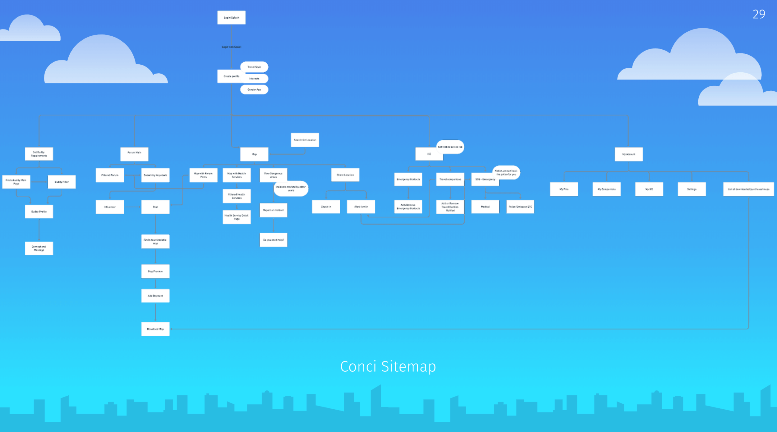
4. App Structure
Once we had our primary features validated, we set about building out the app.
METHODS
App Mapping
Design Studios for each primary feature
Wireframing


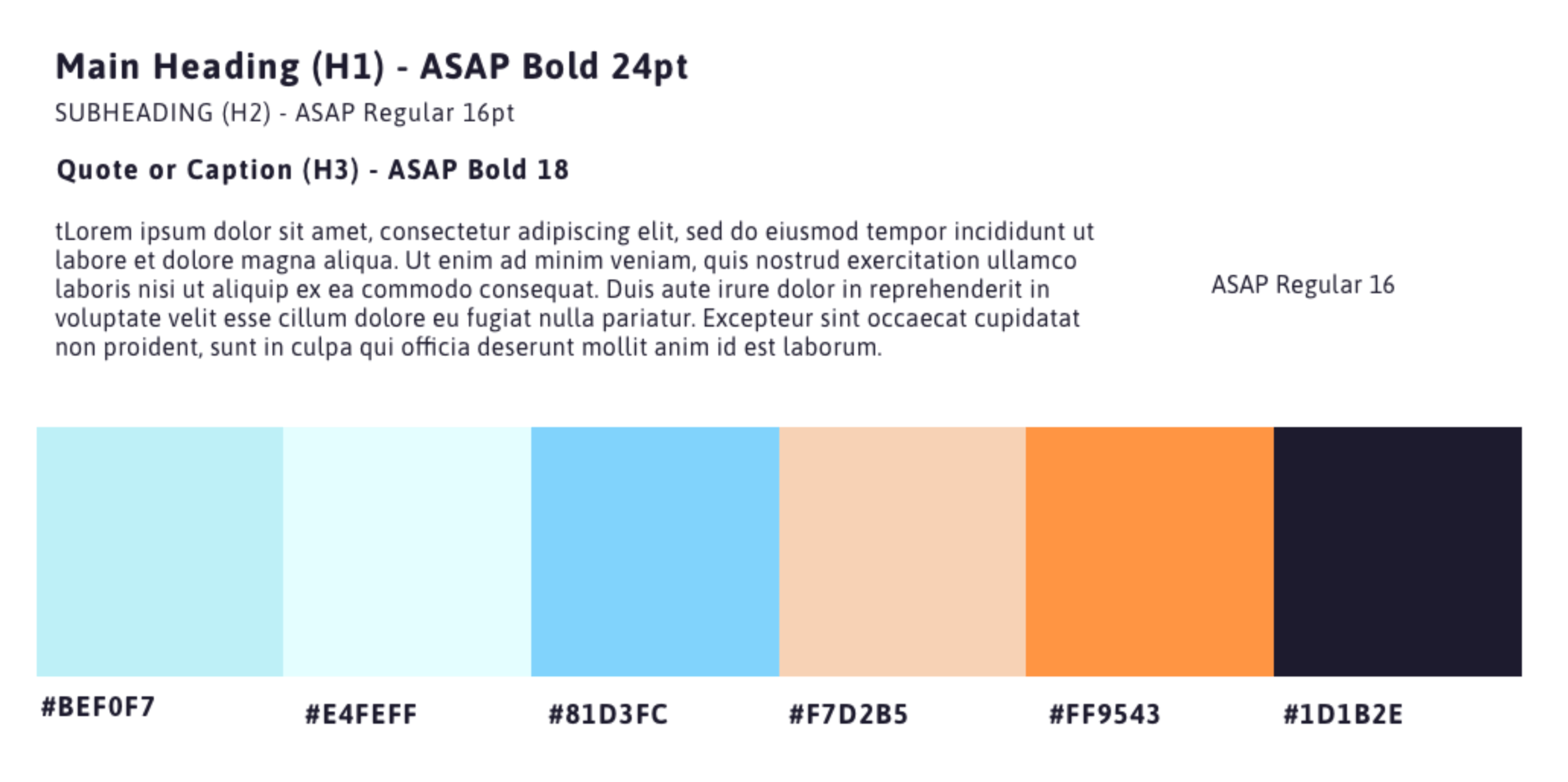
5. UI & Branding
What we wanted to communicate:
Trust
Safety
Fun
How we wanted to communicate:
Blue color palette
Blue represents freedom and expanse
When used in branding blue can convey loyalty/trust
Familiar iconography
Since our user would be using the app in an unfamiliar setting, we wanted the interface to feel familiar, especially if their safety was on the line
Sky/airplane motif
Modern typography, playful logo

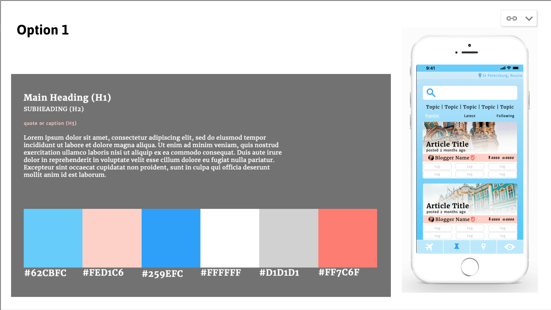
MOOD BOARDS
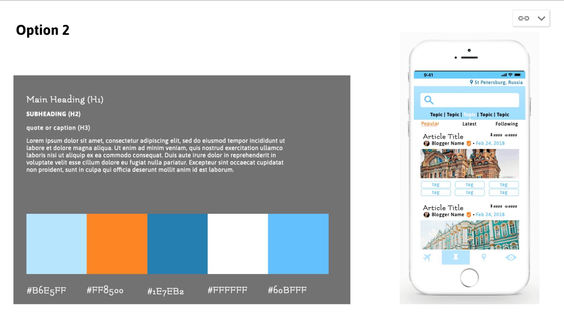
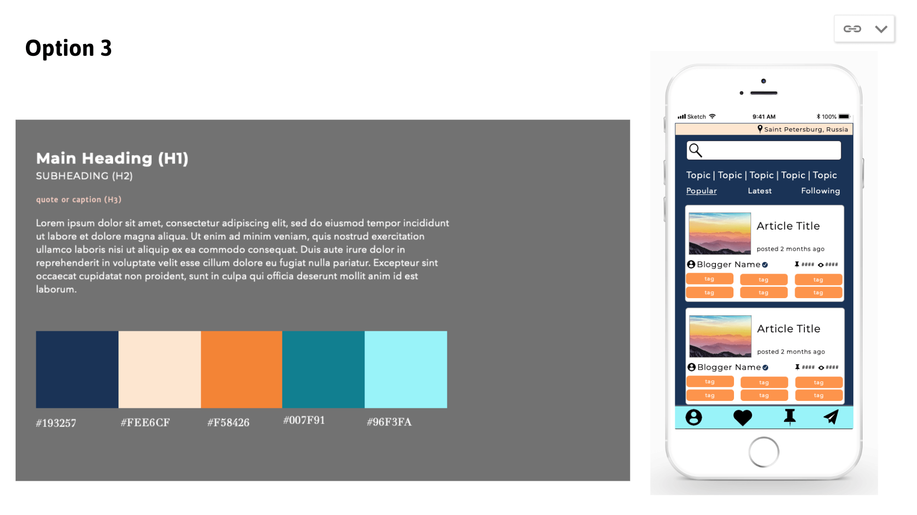
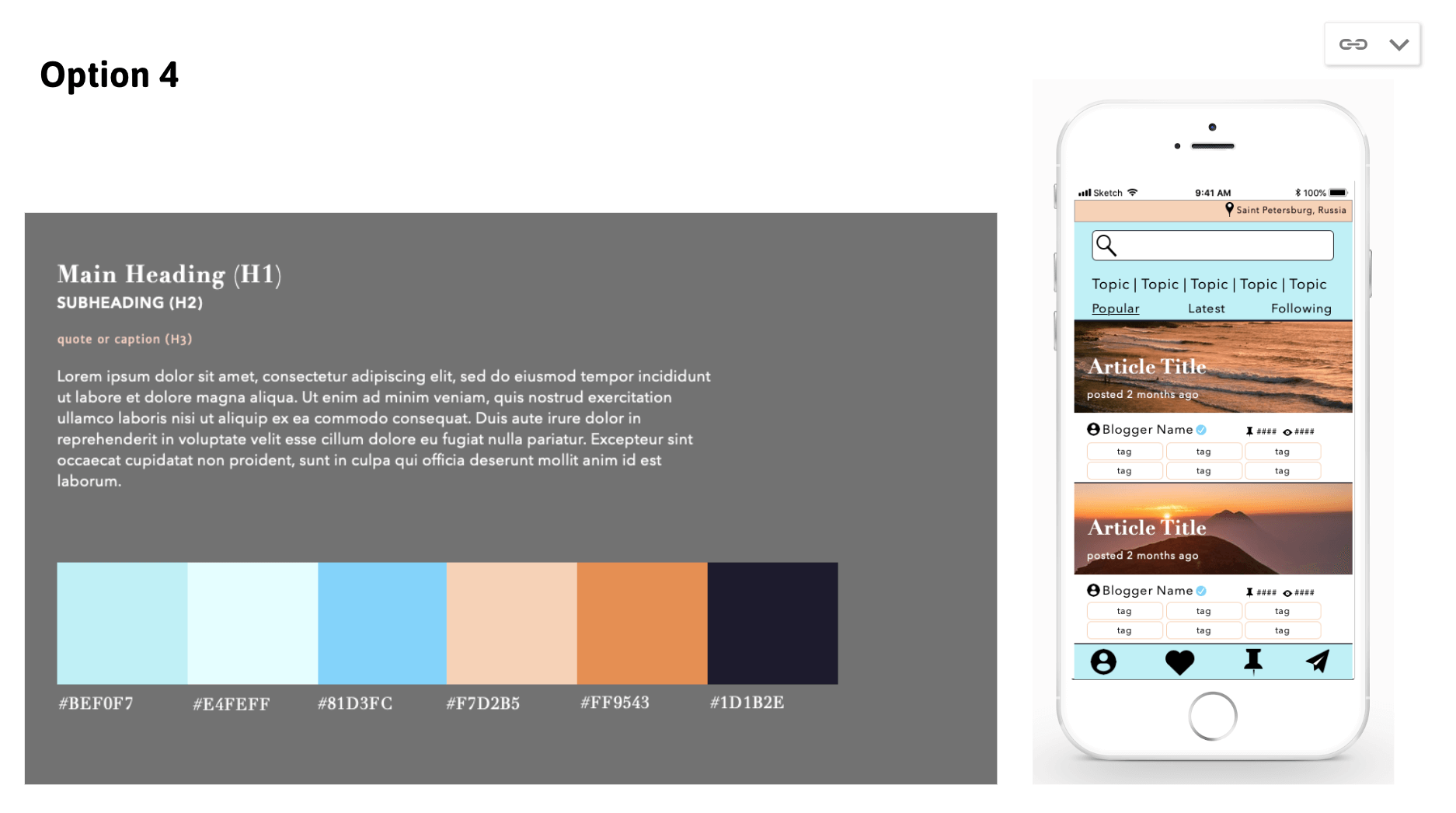
We created four different mood boards for the client, each featuring a different color palette and typography, as well as a low fidelity mockup using our wireframes.
She chose her favorite two, and we combined them to create a final version
Because this app is so large, we only had time to flesh out 4 of the 6 primary features - this mood board will help our client build out the remaining screens with future UX teams
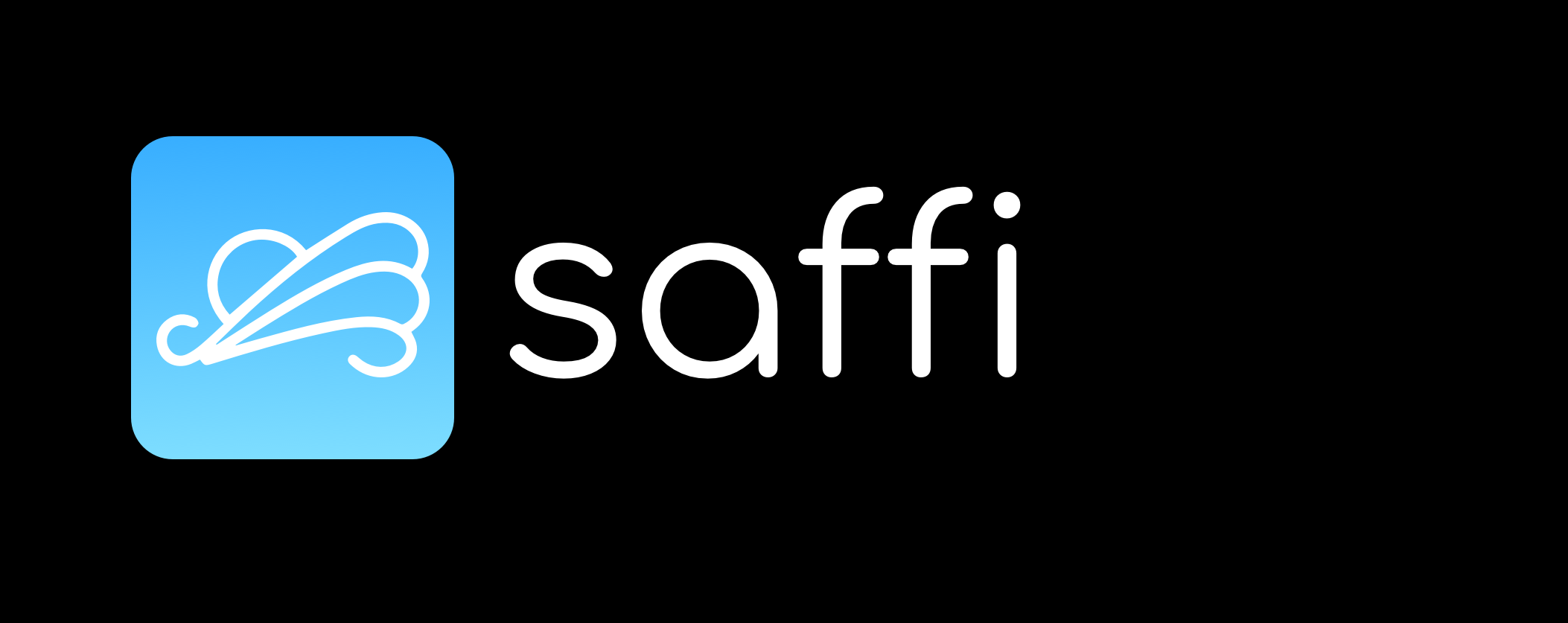
NAME
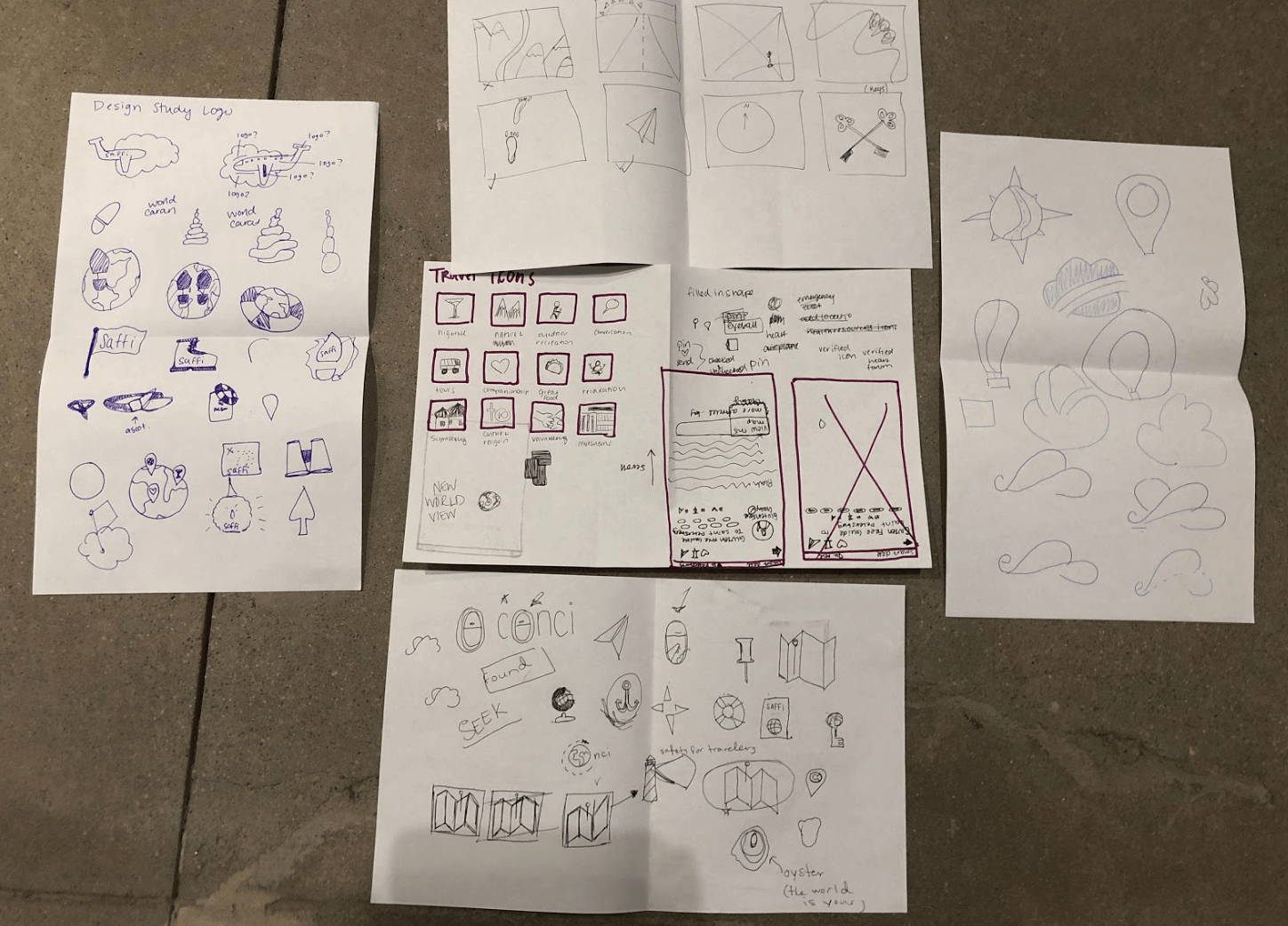
We came up with dozens of names for the app during the course of the project, but finally did a design studio where we pulled out our top 3 to present to the client:
Saffi
Trek.ly
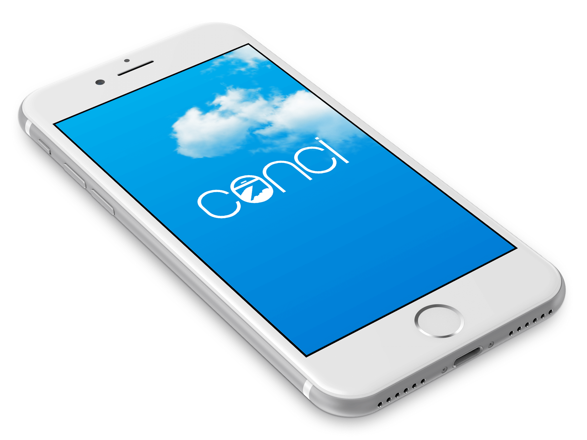
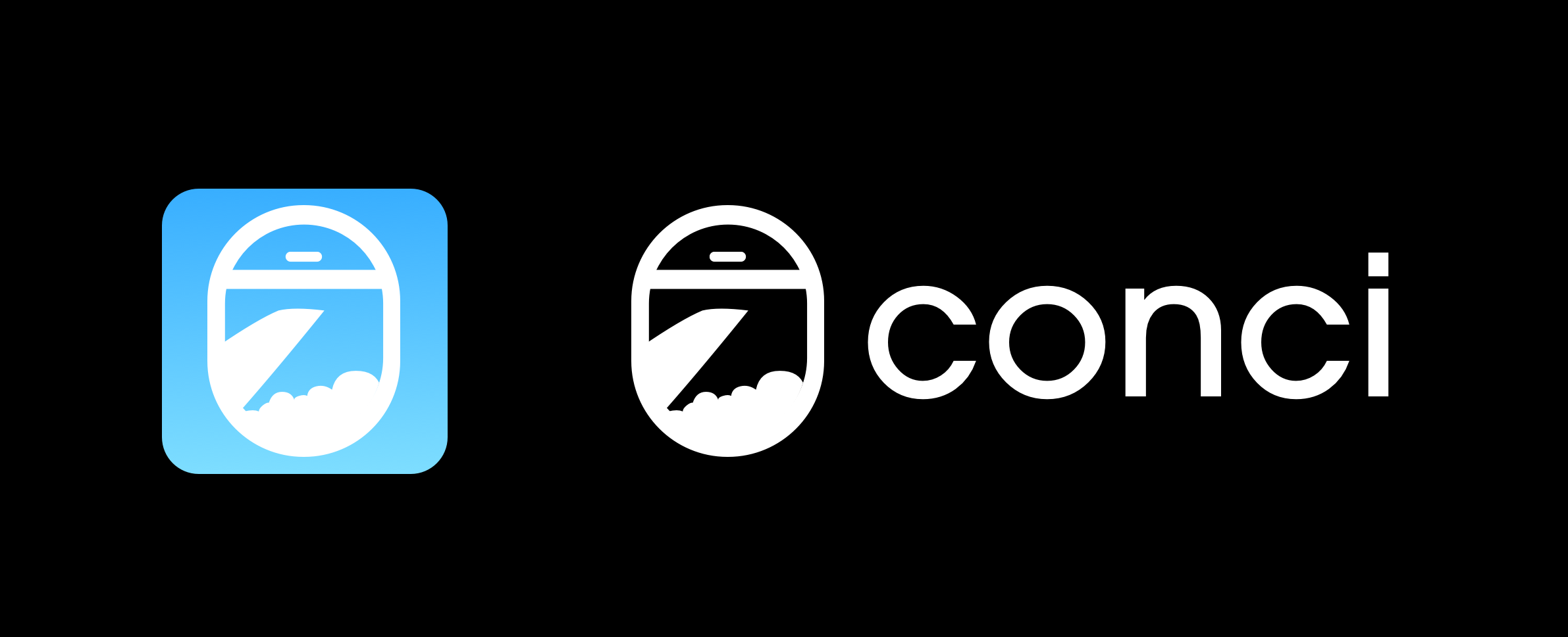
Conci
Our client and her team chose Conci, deriving from the word “concierge”

LOGO
My initial design was a stylized version of an airplane window
Our client wanted to see more options, and we realized we needed to create a two-color logo
The bulk of the information in our forums will be provided by travel influencers, who our client intends to seek out for partnerships
Influencers frequently have their own branding and will transfer the logos of their brand partners into their own color palette
We created two other logo options in addition to the airplane window view
Paper Airplane: this logo ties in the airplane theme with the idea of one traveler passing a note to another with her tips and tricks
Abstracted Cloud
We pitched a selection of options for Lisa, showcasing different typography, logos, and names
From the provided selection, Lisa chose her favorite combination.

Logo Design Round 1

Logo Design Round 2
AND THE WINNER IS…
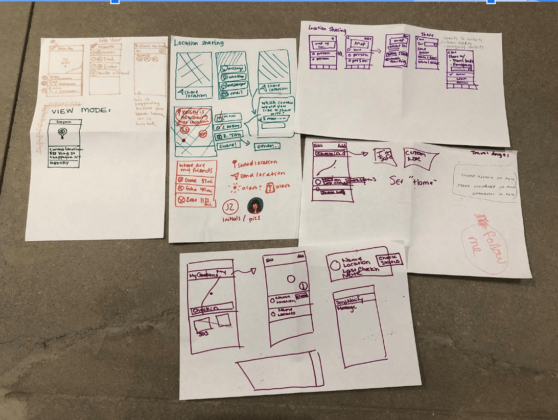
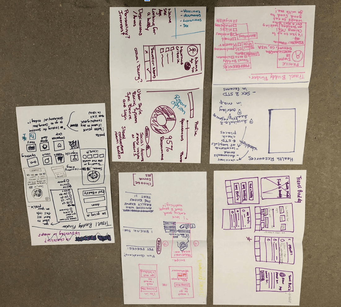
6. Our Users
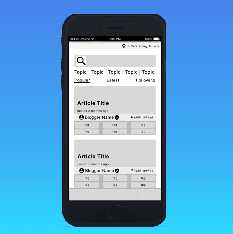
With the branding established, we set about creating our personas and user flows. These user flows are mid-fidelity mockups that, due to time constraints, have not yet been through user testing. They are intended to showcase how specific features operate and connect to one another.

Deb: The Conscientious Planner
“It’s easier for me to plan things out at home, but it’s hard to find restaurants to accommodate my gluten allergy abroad.”
USER FLOW #1
Deb’s user flow showcases 3 of the 6 primary features of Conci.
Deb searches the Forums for tips on eating gluten free in St. Petersburg Russia, encounters an interesting blogger, Gluten Free Gabby (Gabby: The Influencer) and purchases her map. She then searches for restaurants using Maps, toggling on the “dangerous areas” map so that she doesn’t find herself in a dangerous area. Once she’s picked a restaurant, she uses the Emergency Contacts feature to let her fiancé know where she will be dining.

Sabrina: The Spontaneous Adventurer
“I love the freedom of traveling on my own, but am sometimes discouraged from doing certain activities alone.”
USER FLOW #2
Sabrina’s user flow showcases the Find a Travel Buddy feature of Conci.
Sabrina wants to find a travel companion in Chiang Mai, Thailand. She is prompted to create a profile before she can view and message other users.

Gabby: The Influencer
“It’s difficult to have a stable income as a world traveler and influencer, but I have a lot to share and would love to be a resource for other adventurers.”
7. Next Steps

In 3 short weeks my team was able to provide:
1. A robust set of validated features
2. A target audience and marketing strategy
3. A clear brand standard guide
4. An infrastructure for future design

Next Steps for the Conci team:
1. Build out additional features in prototype
2. Do usability testing on prototype
3. Create an influencer-facing interface/profile